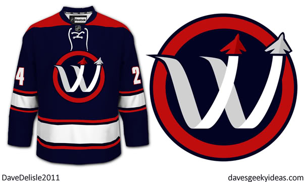
Updated Winnipeg Jets Logo
Here is the old logo on a similar jersey:
I still love the logo but the baseball letter always bugged me. Just wanted to show two jets flying against a blue sky, and their path of movement seemed like an unavoidable arch. Certainly fills the circle nicely, but it looks a bit too Washington Nationals.
UPDATE: Added a circle-less logo and punched up the blue as per Reed’s great suggestions below, and one with an angled ‘W’:
They both look good to me! I always included a circle before because that was trademark Winnipeg Jets, and it also served to highlight the blue jet. Now that the jets are red and grey, the circle can be dropped. Has a nice Montreal Canadiens meets Minnesota Northstars vibe. The angled logo is also more dynamic too.
Update: Here is a refined version of the logo, thanks to feedback from others here and at the Chris Creamer forum:

Another version:

Now with grey, and simplified jets:

One more edit. I still prefer the previous one overall. This one is a nice alternative:

Posted on November 5, 2011, in Hockey, Jerseys and tagged Hockey, Jerseys, NHL, Winnipeg. Bookmark the permalink. 5 Comments.

this is my favourite alternate jets logo. love the jet trails as the w. not big on the colours as a jets fan and winnipegger blue is very important symbolically represents the wide blue prairie sky and needs to remain dominant . id be fine with losing the circle and keeping it minimal as possible .
Great idea, I made that one as well. Thanks!
I love it. Although the triple red is too much, id replace the big red bar with light blue or white.
I hope you don’t mind if I use it as my forum avatar.
Great Concept Dave…. keep it up! no pun intended
You Nailed it. Wow!