
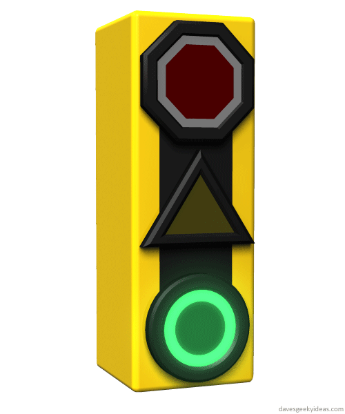
The green light conveys motion using an animated sequence, the yellow light is shaped like a caution triangle, and the red light is shaped like a stop sign, but with an animated white border to show more urgency and danger.
This might be ideal for color-blind folks, who might appreciate the different shapes.


How about blacking out triangles at the bottom, top, left and right of the octagon so that you have a big red X for the stop light.
An “X”-like shape would be easy to translate as stop, so that is a decent option. As long as the X is a big bold shape, not a couple of thin lines intersecting - needs to be seen from afar.
Shaped traffic lights already exist:
I know. This should have been listed in the Pingbacks: https://davesgeekyideas.com/2011/11/19/traffic-light-idea-revisited/
Wow - funny how RED= Octagon or “X” or square (max size) , AMBER = triangle, and GREEN = circle was exactly what I thought of for my family of colorblind sons. I can’t believe we let tons of metal travel past each other at life-threatening speed on the basis of COLOR alone. We don’t even do that for a harmless webpage.The other mind-blowing thing about all this is that the transition from globes to LED’s was the perfect opportunity to make the switch.
The other (super simple) option I had was make all green lights arrows. (we have them already). This way “GO” is always relatively faint. (But this might be an issue when GO should allow turning also- which leads to multiple arrows. But then, these are usually ‘safe’ or simple single lane intersections, so they could get a circle for GO). And another possibility is to utilize flashing or animation (assuming LED’s of course).
But one would assume this has all been studied hundreds of times in exhaustive scientific studies for the millions of colorblind drivers and the millions of traffic lights, wouldn’t one? I mean, they should have spent, um let’s see, about $10 million on the research and testing roughly…Surely…
Tim
.