
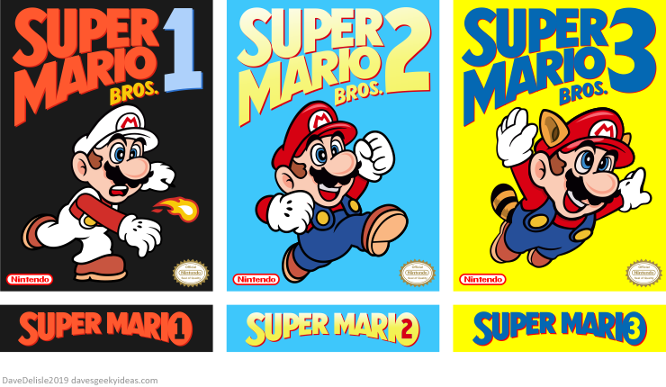
This was just a personal pet project to make all three Super Mario games for the NES look uniform in appearance, mainly in the style of Super Mario 3. The lower wordmark logos were for the sides of the box (and the top of the cartridge label too). Nothing against the first two games’ box art, which are iconic, this was just for fun.
The goal was to print these for some plastic clamshell boxes (like these ones I have) for display on my shelf, but I gave these games away to my nephews last year. Might still do this if I ever get the games again.


Oops. Right hand in Mario 2 has 3 digits. I’m sure no one will notice.
These are gorgeous! Would you be willing to send me a high res copy?
Sorry, these are just for me!
You’re breaking my heart here! hahaha
Stumbled upon these in a Google Image search, and just wanted to say how much I absolutely adore them!! But I had an idea to tweak these if that I just couldn’t help but share… On MY dream covers, I would use the basic Jumping Mario on the Mario 1 cover, and re-work the Fireball Mario idea into throwing a turnip instead, since Mario 2 is more designed around throwing mechanics! 🙂 Just my two cents! Would love to see high-res versions of these, but I understand if not!
Pretty cool, although I would have had Mario holding the turnip in Mario 2.
Broke My Heart Here