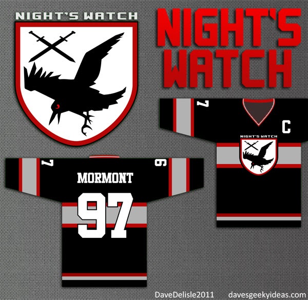
Game Of Thrones Hockey Jerseys Part 3: The Night’s Watch

Went for a Russian theme for this one, which is appropriate because the similarly-named Night Watch is the name of a Russian film by Timur Bekmambetov. Great film.
The cold and icy color scheme was previously used for the Direwolves jersey. I like to have variety in these designs, so the Russian crimson was enlisted here. I will approach these Game of Thrones jerseys as though they were all in the same League, so they each need to have a unique identity and color scheme.
The mid-stripe is similar to the one used by the Montreal Canadiens for their home jersey, and is intended to evoke the Wall, where the Night’s Watch are situated.
The Night’s Watch doesn’t have a sigil, so I thought I’d make a logo based on their nickname - the crows. I know crows is used in a derisive way in the books, but it’s a cool animal to represent a hockey team.
Posted on August 13, 2011, in Art, Hockey, Sports and tagged Game Of Thrones, Hockey, Jerseys, Logos, Sports. Bookmark the permalink. 1 Comment.


very cool, please keep it up with these! I will eventually pick a favorite and you give you my money. So far Direwolves are coolest, but i really like the Mormont with the C on the front. Nice touch!