Blog Archives
New Orlean Hornets Rename Submission
Paul Lukas of Uni-Watch is running this contest on ESPN asking for submissions to rename and redesign the New Orleans Hornets, as apparently the new owner has expressed an interest in doing just that.
For those who don’t know, the New Orleans Hornets were originally in Charlotte. When they moved they kept the name, and now the new owner feels it’s not representative of New Orleans.
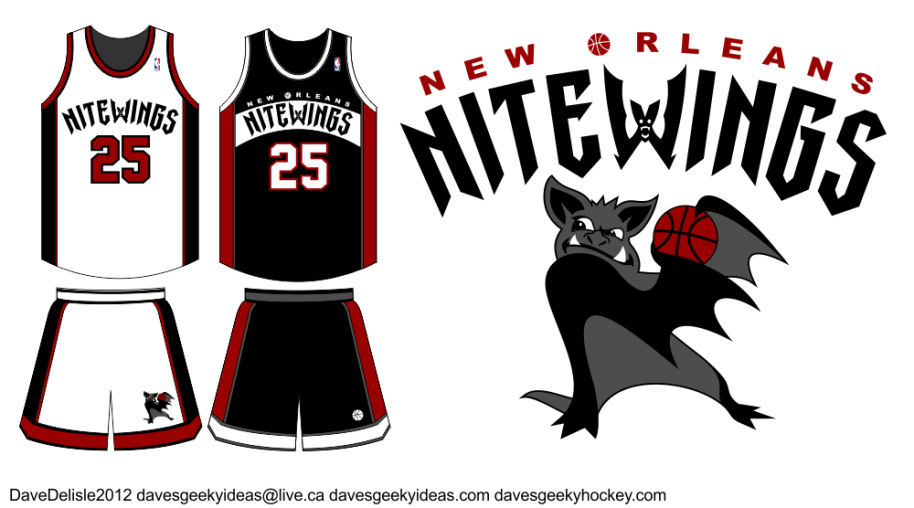
To me New Orleans is about gothic culture, so I thought it would be fun to do something Vampire related - because I’m such a geek if you haven’t already noticed.
Names like Hunters, Slayers, and Bats were considered. My favorite was Daywalkers, but that is now used in reference to Gingers (thanks South Park!). Nightwings had a nice ring (like the Batman comic book character), but to make it symmetrical I opted for Nitewings, allowing me to turn the ‘W’ into a bat.
The main logo I didn’t have much time to work on - the submission deadline was this morning. Overall I think it works. It represents the city, the name is two syllables (two or less is ideal for a team), and it sounds similar to New Orleans. The color scheme unfortunately is too similar to the Miami Heat and Chicago Bulls. Black and Crimson seemed appropriate.
Game Of Thrones Hockey Jersey: The Starks

Note: All hockey jersey offers are now at www.davesgeekyhockey.com.
Lately I’ve been held hostage by all things Game of Thrones. I took a moment to step back and realize all these different Kingdoms could be represented by sports teams. They each fly a banner bearing a sigil, usually depicting a fierce animal - much like a typical sports franchise would.
The above example shown is the Direwolf, which is emblematic of the House Stark. The Starks reign in the north, and their (foreboding) motto is “Winter is Coming”. To me it all screams hockey.
You could probably design several hockey leagues based on the huge number of banners in the Game of Thrones books, though only a few are prominent. The aforementioned Starks are the main protagonists. The evil Lannisters (I may be editorializing a bit) have the sigil of the Lion. The Targareyans fly the banner of the Dragon. Like Milwaukee, the Baratheons are represented by the Buck.

Sale mockup.
I know I frequently design hockey jerseys here, and you might think it’s because I’m Canadian and thus have a one-track mind. The real truth is hockey jerseys are a brilliant canvas on which to showcase a team’s identity. That logo on the chest is like a Superhero insignia. No other sport has a jersey or uniform where the team logo can be so prominent. EDIT: A friend tells me these would look better on a “football kit”. Well I say good day to you sir. GOOD DAY.
EDIT: Got an email from Mark, who says the Stark sigil is a full-bodied silver Direwolf on a white background (white = ice/snow), and that the Baratheon sigil is the Stag, not a Buck. My bad. I won’t make a full-bodied Direwolf, but I’ll fix up the logo a bit:

Bonus art! Using the Tampa Bay Lightning royal blue alternate jersey:

I will design jerseys for the other Game of Thrones Houses eventually, stay tuned!

