
Last year Hyperkin unveiled their Retron 77, an Atari clone system with HDMI output. It has a similar look to their recent Retron 1 HD and Supa Retron HD systems. The company makes good-looking clone systems so I’m a big fan of theirs.
However they recently revealed the final version of their prototype (which I did like), and the new design struck me as odd. Here is a comparison:
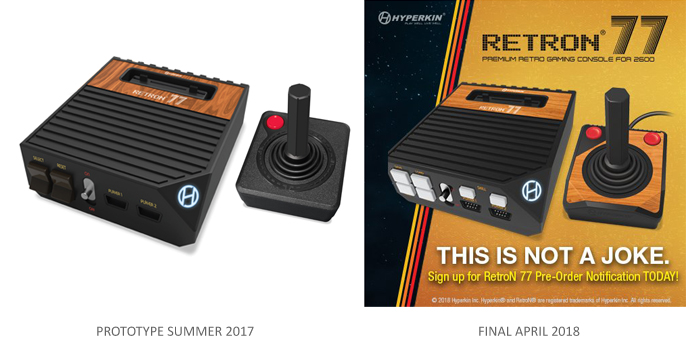
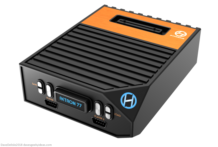
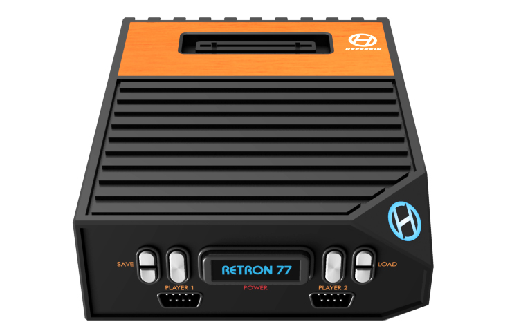
All the buttons look like sugar cubes. It’s a passable design, but compared to the Retron 1 HD and Supa Retron HD, it’s not as faithful to the system that is being cloned, in this case the Atari 2600.
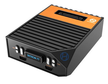
So I shuffled around all the buttons and controller ports, made the buttons capsule-shaped, and changed the power button to a mini-cartridge. The mini-cartridge has the same push-button design that the NES power button does.
The ‘CALL’ buttons have been placed above their respective controller ports. This layout is intended to be more evocative of the 2600. The RETRON 77 badge was moved to the cartridge label, mostly because I wanted the HYPERKIN logo by itself on the wood panel, much like an ATARI logo would be.
I try not to use my blog to be critical of others and their creations, but as an avid fan of console design, I felt the Retron 77 could be improved a wee bit. Obviously this is all subjective, my concept could be uglier in the eyes of some people. What do you think?


I did not understand this atari design, I recognize that the hyperkin models for nintendo, super nintendo and genesis systems were excellent. For more faithful to the atari: the wooden front is not near the cartridge but in the front of the console; in the part next to the slot cartridge should be silver and have the button-shaped buttons goes up and down; console format should also be horizontal