Archive for October, 2010
Ghostbusters Firehouse Papercraft
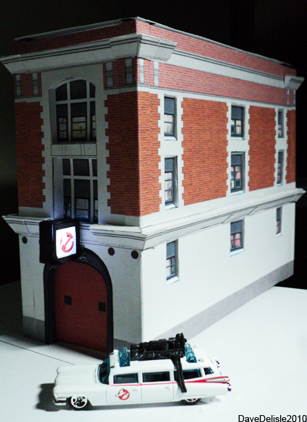
So here it is, in all it’s glory. Consider this version 1.0, as I’d like to do more on it, but for the sake of time, and Halloween just days away, I thought I’d get something out there.
I recommend using card stock for this one, it is BIG. Normal paper might buckle. Also, my lame printer does not go as dark as I would like, so yours may be darker (do a test print). And lastly the diagram is designed with thicker card stock in mind, so scaling it down for normal paper might cause a few issues.
Right now the roof is just sitting on the building like a lid, which makes the wiring very accessible. Otherwise it’s 95% complete. Took about 3 hours to cut and assemble.
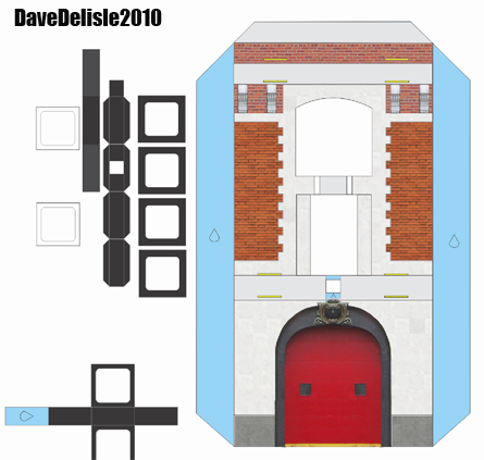
Enough talk, here is your ginormous diagram:


As for the LED instructions, probably a bit too advanced. I recommend cannibalizing some christmas lights, and reduce a string of lights down to one solitary light. If you want to go the LED route, seek out an electrical guru, or go to a store that specializes in electronics (LED’s, Switches, Boards, Wiring). Assembly requires soldering and all that jazz. But it looks amazing. The pictures don’t capture that cool ‘touch of purple’ tint.
Other things you could do: Print a sheet of glossy photo paper black or dark blue, cut it up into windows, and use instead of the ones provided (you’ll need to punch those out).
A sidewalk would be cool! Also, there are two cylindrical yellow guards that sit in front of the garage door you could probably whip up. I didn’t have time for either of those.
Any feedback is appreciated. This is only my third papercraft creation, and my first real attempt at something a bit more advanced. Thanks and enjoy!
18 comments October 29, 2010
Ghostbusters Papercraft Update #Eleventy Hundred And One
It won't look this grainy, promise!
I am 80% completed the textures, just need to do the windows and a few other details. For now, I decided to make the building look clean, and do a filthy soot-covered one later, so it resembles the actual building:
Just dirty. If you look at the lower right side near the sidewalk (just above the police car), you’ll see what appears to be an attempt at cleaning the outer walls. Looks like someone did a single line with a pressure washer and called it a day. You’d think that in a fire station they’d have a hose lying around to wash the building! Ah, nothing like a jab at New York’s finest.
I figure this thing will take 6-7 sheets of 8’5″ x 11″ paper. The final building measures just under 7.75″ tall, 9.75″ long (10.5″ measured to sign), and 4.5″ wide.
Add comment October 27, 2010
Amazing Ghostbusters Mashup
It’s Ghostbusters week here I guess! I found about this WaxAudio song when I was reading about the DJ Hero video games, which are comprised entirely of mashup music. Mashup songs feature 2 songs from different artists mixed together. The results can be pretty wild:
Pretty cool. Check out more WaxAudio stuff on youtube, especially their Pink Floyd/Bee Gees mashup, which is also brilliant. The Bryan Adams/Metallica one is a tad disturbing.
Here is a DJ Hero song, featuring the Gorillaz and Gwen Stefani. I wish I could listen to it without the rewinds or DJ powerup sounds:
Have a good Monday, if there is such a thing!
Add comment October 25, 2010
Ghostbusters Firehouse Update #6,734

Intentionally pink for breast cancer awareness month! That's a lie. Just wanted to save a bit of ink.
Bad news, it’s still not ready to post. Good news is, the diagram is complete! I just have to texture it over the next few days, and make it printer-friendly and create some instructions. I promise it will be ready well before Halloween!
I managed to create an awning system that runs the perimeter of the building. You fold once, and it sits in some slots. I didn’t glue any of it actually, it’s all just plugged into the building walls.
I also made a sunken roof , pictured inset (also not currently glued, just plugged in) that helps tie everything together.
I quickly threw this one together, hence the sloppiness. I just wanted to test the awning and roof to finally complete it.
Apologies for the delay, I am new to this papercraft thing, and I wanted to ensure a flawless diagram that won’t frustrate anyone attempting it.
Add comment October 25, 2010
Comic Book Idea: What If Batman Literally Was A Dark Knight?
I just read Superman: Red Son, which was a very interesting “what if“ tale that had Supes crash-landing in communist Russia instead of Kansas. I really enjoyed the book, though giving guest-star Batman a Russian origin as well was really unnecessary and a bit forced. Batman even had a toque/hat over his cowl!
It reminded me of a take I had once envisioned for the Dark Knight, in that he was literally a Knight. I can’t recall if this was before or after Medieval Spawn (*sigh!*). Regardless, I thought this idea through a bit, and think it would make for an interesting miniseries.
This Batman will not be Bruce Wayne. He’d bear a name of the era, like Krygon Enegard II, the rightful heir to the throne of the Gothan, a once-peaceful Kingdom.
His time as King was only for a few moments. While he was a small child, his parents the King and Queen were brutally assassinated by the Jester and his minions in the throne room. The Jester placed the bloodied crown on Krygon’s head, and comically bowed and pledged to entertain the new King. The crown fell down around Krygon’s neck, and saved him from a decapitating strike from the Jester’s sword. Krygon barely managed to escape the bloody overthrow, thanks to the final act of a nearby fallen Knight, who caught the Jester with a thrown blade to the eye.
Free of the Castle, Krygon is aided by some local townsfolk, who smuggle him out to the countryside. The dented crown is clamped around his head and neck, and he is taken to a blacksmith to have it removed. A molten rod slowly cuts the crown on both sides of his head, disfiguring Krygon in the process. The two halves of the crown lie at his feet, and he notes that it looks like a Bat flapping its wings.
The Jester assumes rule of the Kingdom. He is aided by Razghul, his dark wizard. KillerDragon, a large brute covered in scales. The deadly Harlequin serves as the Jester’s bodyguard. Henchmen like the Scarecrow and Monster-Face police and terrorize the people of Gothan.
Krygon flees to the neighboring Kingdom of Polisia, which is an Allie of Gothan. Because of this, the Polisian royal family adopts Krygon, and pledges to retake the fallen kingdom of Gothan on his behalf.
Attempts to retake Gothan prove disastrous, and the Polisian army suffer great casualties. Polisia decides to withdraw from it’s war efforts. This angers Khaled, and he vows to return to Gothan and dismantle the Jester and his minions one by one, no matter how long it takes.
After extensive training in many forms of combat and defense, Krygon slips away from Polisia and makes his way back into Gothan. He returns to the blacksmith shop that originally freed him from the crown, and finds it abandoned and in ruin, like much of Gothan.
Surveying the place, Krygon finds the remains of his father’s crown sitting on a shelf, still looking like a bat in flight. He decides to setup a base in the cellar, and begins to use the many tools and equipment to forge weapons and armor.
Krygon forges his suit of armor and sword to depict the Bat, not to intimidate those he’ll fight, but to remind himself of his father’s destroyed crown.
His one-man war against the Jester has just begun.
My other comic book ideas: Superman, Transformers
Add comment October 24, 2010
Ghostbusters Hockey Jersey
When I saw the image of Bill Murray accepting his award for best cameo at the Spike Scream awards (pictured inset), I thought the Ghostbusters uniform would actually make for a great hockey jersey. The GB logo is circular which is very fashionable on hockey jerseys, and those elbow pads could look like sleeve stripes.
Of course, you could mimic the actual GB uniform, and put the logo on the shoulders and a name plate on the front instead. The jersey could also be black/white/red to match the logo, instead of the brown.
I should just turn this blog into a Ghostbusters fan site, eh? I blame the Halloween festivites for all the recent posts about Ghostbusters.
To see a few more pop-culture inspired hockey jerseys I designed, check here.
UPDATE: Well looks like someone already fashioned a GB hockey jersey! It’s a bunch of logos sitting on a white Blackhawks-type jersey. See it here. It’s a fan-made one though.
Add comment October 23, 2010
Another Ghostbusters Update
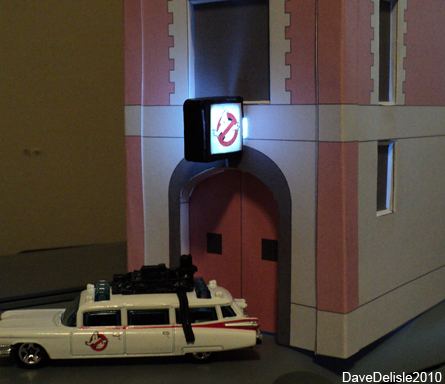
It actually looks much cooler in person.
Still plugging away on this project! I tried out the LED light, and it turned out better than I thought. It uses Card Stock for the sign fixture, and normal paper for the sign itself.
The best part of this, is that is uses one of those amazing Aduino board chips, with a USB plug adapter. The light comes on as soon as the USB is plugged in. Whenever I power up my PC, the light will illuminate automatically. Very cool.
I’m going to have to do some more alterations to keep light from flooding the interior and leaking out the windows.
And for those not going the LED route, a normal box for the sign will be included.
Add comment October 23, 2010
Nintendo Celebrates 25 Years By Painting Consoles Red
Red DSi DS XL
Red Wii
Nintendo is celebrating 25 years of Super Mario with two commemorative hardware packages, a red Wii bundle and a red DSi XL bundle, both featuring Mario games to boot. The Wii also features the new Wii Plus remote, which removes the Motionplus add-on altogther (it’s now built-in).
Neither of them look too bad, and both offer excellent value. My one complaint; they both feature some of the most popular games of their respective platforms, nothing really unique for the occasion. Why not the fancy Super Mario All-Stars game like Japan is getting? Or an all-new Mario bundle of greatest hits - All-Stars 2, anyone?
I actually hoped Nintendo would offer a retro NES theme for both platforms, sort of like what they did for the GBA several years back:
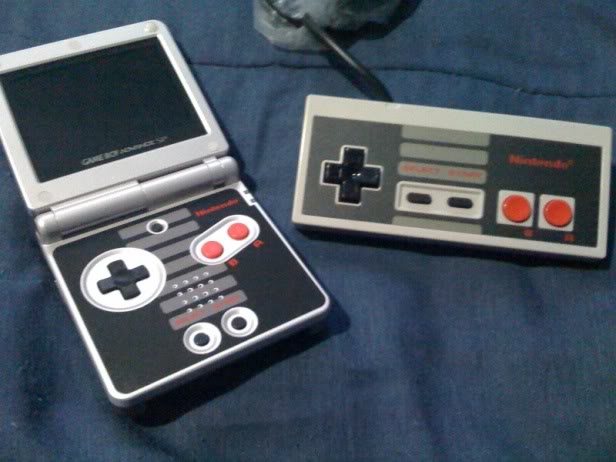
NES-Style GB Advance
This is because both the Wii and DS are boxy in their design, whereas previous consoles (Gamecube - the controller anyways, and the N64) weren’t. I made this quickie design concept to show what the Wii could look like (and yes, they can sit flat like this):
While it isn’t the most eye-pleasing design, the look of the NES carries a lot of nostalgic weight, something that would have been ideal for this 25th anniversary.
Silver would also have been ideal to commemorate 25 years (the silver anniversary), but the DS has already released many SKU’s in that color. A silver Wii would still be nice, but you might have to wait a long time, as North America just got it’s second Wii color - black - this past summer after having only the white one for the Wii’s first four years in existence.
Still, these are better than nothing, and 25 years of Mario is a huge deal in the gaming industry. Congrats Nintendo, here is to another 25 years!
Add comment October 23, 2010
Firehouse Update
Here is a quickie update on the Ghostbusters Firehouse papercraft. I thought I’d attempt the upper overhang fixture to see how it fits…looks meh at the moment. The building itself is very quick to cut and assemble, if I say so.
Again, it’s not textured, just used a pink fill as a temp texture - and to save ink. The final one will be shown in all it’s brick and concrete glory.
Thanks for your patience on this one. Hopefully this weekend I can release it, just needs a bit more finesse and some trial and error to get it right.
Add comment October 23, 2010
Papercraft Tips And A Boo For Canon
Papercraft Tips and tricks
I’ve received a few emails asking for tips about papercraft, but in no way am I an expert! I am starting to get a little more confident with this, and the Ghostbusters Firehouse is shaping up to be quite awesome. So I thought I could at least share how I go about making this, but it’s probably not papercraft doctrine per se.
Firstly, normal paper sucks. It’s got no strength, it’s a little transparent, and wrinkles very easily with glue (if the printing hasn’t already done a number). So after hunting around at Staples, a salesperson told me about Card Stock, the kind of paper you print greeting cards on. This stuff is awesome. Pricier though - that bundle cost me $17, whereas normal paper is about $3-5 a bundle.
Next up, a cutting board is hugely convenient. My first few attempts was with scissors, but now I lay the paper down and cut it up with an exacto knife (box cutter to some), it takes me a fraction of the time. These boards come in all shapes and sizes, and make cutting a breeze. A worthy investment. I use a big bulky exacto - fits my hands.
I wasn’t sure what glue to use, but I saw this UHU stuff and it works good for me. It dries very quick, and allows for some adjustment too. It’s the little tube, not the big deodorant-like stick for which UHU is known.
And obviously a printer is needed. I use an inkjet. Mine happens to be a photo printer, which is capable of handling the thick glossy paper, so I knew it was safe for Card Stock. I can’t speak for all printers though.
If you have any papercraft tips, please feel free to leave a comment, and I’ll include it in this post.
Unfortunately I have to finish this post with a wag of the finger to Canon. I bought this package of ink today for the papercraft project(s), and I was astounded by how much wasted packaging there was:
First off I wasn’t thrilled about the included photo paper (no doubt to tempt you into burning through all the ink), as this package was the only means of replacing my CMY cartridges (no individuals were available). The paper was pretty much free, but I digress.
It’s just that the box was quite big when it didn’t have to be. You can see in the top that is how it looked when I opened it. Two big empty adjacent slots there.
The three cartridges could have lied flat against the paper, and the packaging could have been 1/3 the size. And if it didn’t come with paper the whole thing would be the size of 2″x3″x4.5″ box. A waste of packaging, and when you ship and stock this product, a waste of volume too. Those costs get passed along to the consumer.
I know why they do this. To accommodate other bundle types. They use the same packaging for other bundles that have larger refill containers (and that unnecessary paper too).
And to further draw my ire, the packaging is adorned with environmental self-approval from Canon. You can see the ‘Eco-Friendly Package’ seal at the top of the pic, the bottom of the package exclaims 100% Recyclable/Uses Vegetable Inks/Sustainable Forestry Initiative logos and messages, and the back advertises Canon’s ‘EcoSense’ program. I kid you not. Canon made a larger package that warrants more recycling, used more veggie ink as a result, and put a dent in their forestry initiative - and they pat themselves on the back for it.
Well Canon, you wasted a lot of packaging for this particular SKU, included a widely available product as an unnecessary pack-in (glossy photo paper) which may go unused by the consumer, all in the name of making your products look uniform and aligned on the shelf space. *Sigh!*
5 comments October 21, 2010