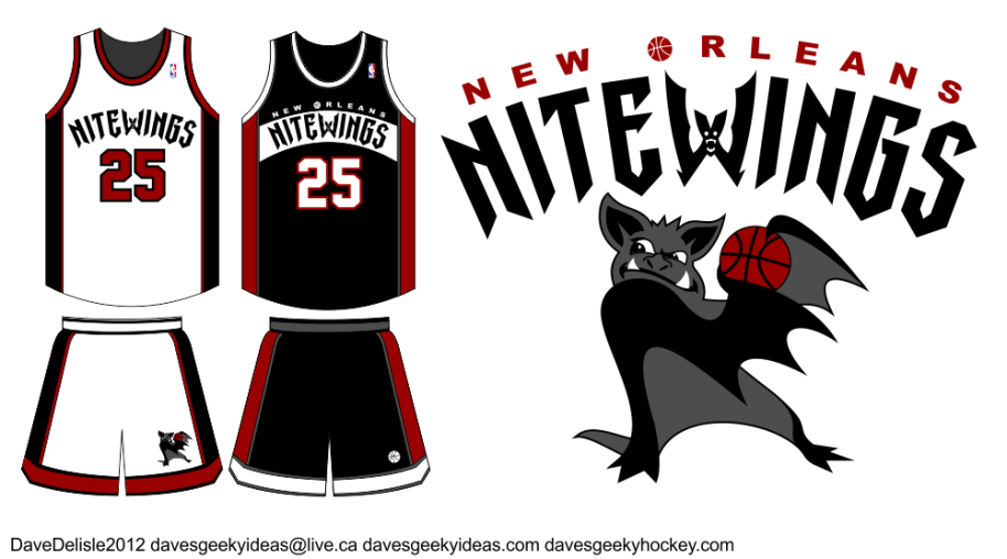
New Orlean Hornets Rename Submission
Paul Lukas of Uni-Watch is running this contest on ESPN asking for submissions to rename and redesign the New Orleans Hornets, as apparently the new owner has expressed an interest in doing just that.
For those who don’t know, the New Orleans Hornets were originally in Charlotte. When they moved they kept the name, and now the new owner feels it’s not representative of New Orleans.
To me New Orleans is about gothic culture, so I thought it would be fun to do something Vampire related - because I’m such a geek if you haven’t already noticed.
Names like Hunters, Slayers, and Bats were considered. My favorite was Daywalkers, but that is now used in reference to Gingers (thanks South Park!). Nightwings had a nice ring (like the Batman comic book character), but to make it symmetrical I opted for Nitewings, allowing me to turn the ‘W’ into a bat.
The main logo I didn’t have much time to work on - the submission deadline was this morning. Overall I think it works. It represents the city, the name is two syllables (two or less is ideal for a team), and it sounds similar to New Orleans. The color scheme unfortunately is too similar to the Miami Heat and Chicago Bulls. Black and Crimson seemed appropriate.
Posted on April 27, 2012, in Basketball, Jerseys, Sports and tagged Design, Jerseys, Logos, NBA, Sports. Bookmark the permalink. 1 Comment.


Pingback: Geeky Basketball Logos Updated | Dave's Geeky Ideas