Super Mario Toaster

Super Mario Toaster. Does anything more need to be said?
Well, maybe one thing. I’d make it so each side of bread would have a different image, like the fire flower, star, and coin.
Self-Cleaning Door Knob
Many moons ago, I took a Food Safe course for the province of BC, which helped certify me for work in the food service industry. All the basics were covered, like food handling and basic hygiene.
One topic was the importance of washing hands. It was enough to make me a germaphobe for a few days, certainly impacted many habits in my life. The instructor pointed out that after we wash our hands, the effort is somewhat nullified by the door handle in the bathroom - especially at home (because doors at work usually pressed by clean hands when exiting, but not everybody washes their hands at work), because we close the door with a dirty hand when we commence our use of the facilities.
I am seeing an emergence of Hand Sanitizer dispensers being placed outside public washrooms at work places, which is the right idea. But those seem so optional!
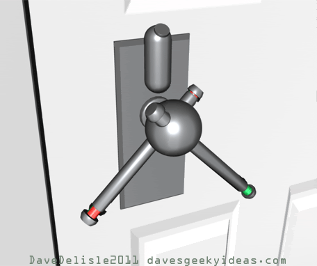
With that I have devised this “self-cleaning door handle”, which basically cleans the handles with a sanitizing agent, after every turn of the door.
Here is how it works: there are two cylinder handles that intersect through a main drum. As the handle is turned, a cylinder would fall through the main drum handle (gravity at work) and get cleansed with a sanitizing coat. There will always be a clean handle at the ready. The sanitizer is stored in a reservoir above the handle (or can be built inside the drum). The cylinder handles will each be fitted with another sliding cylinder, which would be used to indicate which handle is clean using color markers (green is clean).
This would be ideal for the inside knob of the bathroom. You could probably make a more industrial-type version with squeegees wiping the surface of the handle cylinder, but eventually you’d need to open it up and clean all the grime. Ew.
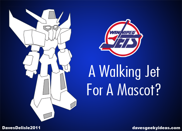
A Walking Jet Mascot For Winnipeg?
This is something I touched on in previous posts with my Winnipeg Mechs design, but I thought I’d write a dedicated post now that the Winnipeg team is going with Jets as their name.
True North Sports and Entertainment, the owners of the Winnipeg Jets, admitted to wanting to forge ahead with another name, likely using Manitobe in place of Winnipeg. This would have been a fresh start for the franchise. It also would be a burgeoning revenue stream as fans would have needed to get new jerseys and merchandise that reflected the new name.
Fortunately TNSE went with the ‘Winnipeg Jets’, and will likely do a lot of business when they unveil their new logo and jerseys later this summer.
One revenue stream that could be very lucrative is a line of merchandise based on the team’s mascot. Especially if that mascot was a robot along the lines of a Transformer or a Gundam - a walking jet. The possibilities for merchandise would be ten-fold compared to a typical mascot.
A line of toys, comics, and other products where robots can reside (practically everything) would be a huge revenue stream, especially if the mascot’s design was well-executed. You could even forge a large back-story with many other characters to expand the line.
Some of the toys would be pricier to produce (like a transforming robot), but not impossible. I’ve seen many toys that incorporate NHL licenses, and these are sold at a premium. A Winnipeg Transformer would be no different.
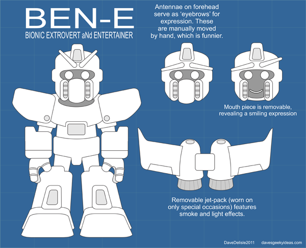
In the past the Jets used “Bennie”, a dog named partly for the owner and that famous song by Elton John. Nostalgia may resurrect Bennie, but he was a generic animal mascot. Using a robot mascot would be somewhat unprecedented and would have much more consumer appeal than a dog. As a compromise the robot could be named BENN.E!
If the team really wanted to knock it out of the park, they’d license Starscream from Hasbro as their official mascot. Not only is the character well-known and has a huge following, but he sports the colors of the Winnipeg Jets too. This would be pricy, but he’d be the coolest mascot in all of history.
In summary, I nominate a walking jet robot to be the mascot of the new Winnipeg Jets. The possibilities for this mascot are astronomical.
UPDATE: here is a basic mascot design. He would normally feature the team colors and logo (which have yet to be revealed), which is why he is plain:
Second Winnipeg Jets Logo Concept
Yesterday it was finally announced: the new NHL team in Winnipeg will indeed be called the Jets. No logo or jersey has been revealed yet, only the vague description from the owners that the logo and color scheme will be familiar.
I thought I’d take another crack at the Jets logo, now that it has been made official.
I’ve always been a huge fan of simple logos that use a single letter to represent the city or team. This approach is common in Baseball, though there are teams in hockey that utilize this style to perfection. The Montreal Canadiens and Boston Bruins are perfect (and timeless) examples. The Flyers, Canucks, Avalanche, and my favorite team the Calgary Flames also use this style for their identity.
With those team logos in mind I crafted this ‘W’ logo, which was formed by two Jets’ vapor trails. It made sense to use two jets, the name being plural and to represent two different eras of NHL hockey in Winnipeg.
This could work as the main logo or even a shoulder patch. I personally like the simplicity, and how you can see the ‘W’ from afar, or even in a small thumbnail.
Here is a more “italicized” version:
A couple of more variants, one featuring a ‘J’ as well. Very New Jersey Devils-like:
Here is a request to see a single plane doing the ‘W’ loop-de-loop. I also thought I’d try one with text, which looks good, but the NHL has been doing it so much these past 5 years! Ah well. Here they are:
New! (July 14 2011):
OOPS!
That Back to the Future 4 Story Idea post was incomplete, and was only supposed to be saved for a draft. I accidentally published it. It was here on the front page for the past 10 hours.
I got a few emails asking why the story suddenly stopped. Apologies to those who read it. The finished version will be posted soon.
If I Ran The NHL Guardian Project
One year ago, the NHL partnered with the legendary Stan Lee and Guardian Media Entertainment to create a branding initiative called The Guardian Project. The idea was to create 30 superheroes that represented each team in the NHL, which would then be featured in an ongoing story.
The aim was to engage kids with the hopes they’ll adopt these heroes and perhaps become interested in the teams and sport for which they represented. The campaign was successful enough to earn a 10-year extension, so kids will enjoy the continuing adventures of these superheroes for the next decade at least.
The widely-publicized campaign suffered a lot of mocking and scorn from the older fans despite the target audience being children. You could also look at GP as being gimmicky or disposable, but only if you weighed all of the material that exists currently.
That’s because the first year mostly served to introduce the brand and the characters. Having to introduce 30 unique characters is a tall order for any ensemble property. Trying to add an extensive story or world in addition to these 30 heroes would have been too much to begin with.
These characters also had to adhere to their respective teams in terms of name, appearance, and abilities, which is a bit limiting in creativity. For fans of these NHL teams, the heroes would be underwhelming and perhaps too obvious in their design. Remember when the show He-Man paraded a bunch of Masters of the Universe in front of you (each also possessing a unique name, appearance, and ability) when you were 5-years-old? Well that’s a how a kid not familiar with hockey would view these Guardians. I’m a little envious of that kid.
And who doesn’t love Stan Lee? I got a kick out of hearing him introduce each Superhero at last year’s All-Star Game, with his trademark gusto no less. The Guardian Project is greatly validated by his name and creativity. If not for him it wouldn’t have gotten my attention at all.
Overall a decent first year, but that’s not to say there isn’t room for improvement. Here is a list of suggestions:
1. Instead of Superheroes, use GIANT robots and monsters (Godzilla/King Kong types). This way their respective cities would make for a cool backdrop. These Guardians would - literally - be guarding their cities.
2. Make them hate each other. Currently all 30 Guardian Superheroes are buddies, in some kind of Justice League group facing a common enemy. Rivalries should be the main focus, with each Guardian for themselves. Kids can learn about rivalries and that hating Toronto is a good thing. KIDDING! Sorta.
3. Each NHL game should be paralleled by a clash of Guardians. The playing teams would be represented as the defending and invading Guardians, with the winning team’s Guardian being victorious. Sort of like placing a wager on a game, but for kids. Not that I want kids to gamble - merely to have a stake in each game that would impact their favorite Guardian.
4. The ongoing story of the Guardians should parallel the NHL season. Teams that miss the playoffs would have their Guardians slain or exiled or something that provides stakes to the Guardian. It would have kids rooting for their NHL counterparts. Sure teams that lose a lot will have weaker Guardians, but who doesn’t love an underdog?
5. A video game extension of the brand. A comic book fits nicely with the current Guardian theme, but allowing kids to play with these Guardians in an interactive manner would make a bigger impression. It wouldn’t be a hockey game (though that could be included), but something along the lines of Street Fighter or Rampage, allowing these giant Guardians to duke it out.
6. A toy extension of the brand: action figures are a no-brainer, as long as the Guardians have appeal in their designs.
7. Apparel that incorporates the Guardians. I’d like to see hockey jerseys that personified the Guardians. You know how Women get specially-tailored sports jerseys (usually pink - darn sexism)? A line for kids that is a mix of NHL team and the respective Guardian would be a hit.
8. Aim for the kids, but don’t be afraid to appeal to adults too. Probably the one failing of the current Guardian Project, is the inability to resonate with the tweens, teens, and adults. It’s not impossible to appeal to all audiences. Many cartoon shows (like Batman The Animated Series) engaged their target audience while being able to win over mature viewers. I think it’s possible the Guardian Project can walk this line (or at least flirt with it) to expand their audience.
So those are my suggestions - mostly a conventional approach that has been used by many entities (like a major summer movie). I would like to see this project evolve and garner some cred with older fans, as it represents a few things I love - namely hockey and comic books.
Ghostbusters Firehouse PC Tower Case
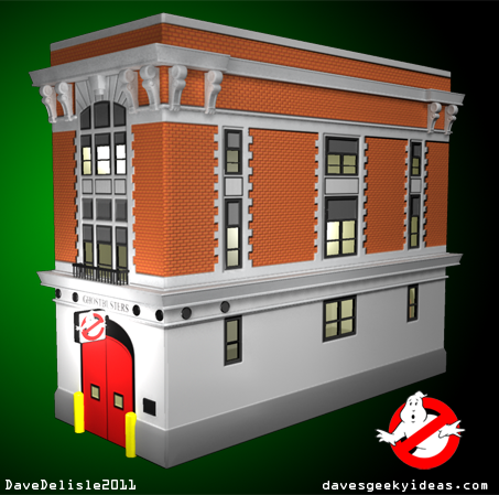
It’s been about several weeks since the last Ghostbusters idea, so why not a new one? Actually truth be told, I suggested this idea over a year ago, and merely presented a sketch drawing of the concept.
The shape of the building makes for an excellent case mod. The Ghostbusters’ sign is the perfect power indicator light. You could even make all the windows opaque, for those who like to see the innards of their computer.
I also originally suggested that the Ecto-1 car be used as a USB hub that is tethered to the building, and can be stowed in the garage. The front doors could even be opened to reveal USB or other ports. I’d also like to see the built-in power supply look like the Ecto Containment Unit, but only if the PSU was stationed at the bottom of the case. There are plenty of things that can be done with this concept.
For now it’s pretty basic. All the buttons are placed on the ledges. The disc tray is enclosed at the top. I didn’t include the vents, but they would be concealed within the window frames.
Last Winnipeg Mechs Concept. Promise.
Sorry I guess I’ve fallen in love with the idea of a sports tteam naming itself the Mechs. I also keep thinking I can do a better design - I STILL think that - sorta scary. Usually I am happy to get the idea across, not too fixated on appearances.
Anyways I went full-on Manga for this design, and I think it looks great. No blacks or greys and I think that helps the design immensely. Here are a few variations as well:
Fortunately we can put this whole Winnipeg team name nonsense to bed this weekend, when it is expected True North will annmounce the name of their team. Sadly their draft pick will be given a generic NHL jersey and cap at the NHL Entry Draft, which is also being held this weekend in Minnesota.
Back to regular programming here at Dave’s Geeky Ideas. If there is such a thing as ‘regular’ here.
One Of My Mech Concepts Was Featured On TV
My Mechs design was featured on the Global National news last night, as part of a segment trying to speculate the name of the new NHL team in Winnipeg. You’ll need to skip to the last 3 minutes of the broadcast to see the segment. I cannot embed the video here (sorry).
As you can see, the name Mechs may have made an impression, but warranted a Google search to figure out what exactly a Mech is. Clearly a sign the name will only ring familiar with a fraction of the market initially. I’m sure given a chance it would be a household name in no time! I’m quite confident a team somewhere will adopt the name, likely a baseball team based in Japan.
I only wish they used a more recent Mechs logo - that was the first one (above) and a straight-up a homage to the Jets, which explains the awkward hockey stick placement. Still, it was very cool to be featured! I’m sure the other artists who submitted ideas got a kick out of it too. Thanks to Johnny at PuckDrawn, whose contest has turned many heads.
Winnipeg Jets Logo Concept
UPDATE (6/26/11): Just added a second Winnipeg Jets logo concept. Click here to see it.
The big rumor today was that the now-official team in Winnipeg will announce their name soon, and it will indeed be the Jets. So I thought I’d give my Mechs idea a rest and come up with something Jets-themed.
What you see above is a formation of Snowbirds, Canada’s air force aerobatic team. For you ‘Mericans, these are Canada’s equivalent of the Blue Angels.
This team often does head-on flybys like this, and usually display smoke trails in their performances. And here those trails form the shape of ‘W’ for Winnipeg. Bonus: the underside of the planes, shown with the red underbellies, have white markings similar to this old Atlanta Thrashers logo, so a neat little homage despite being a coincidence.
The ‘Snowbirds in formation’ is the just the basic concept. Many variations can be done with the the theme: