Wile E. Coyote Blueprints Wallpaper Part 2: Anvil Drop
UPDATE: This is now available as a poster you can buy. Check it out here.
I was about half-finished this one when I released the first one a few days ago - thought I’d go ahead and complete it for a post. I still intend to post many more of these, and probably ones featured in Pinky and the Brain as well.
Here are the wallpapers, two large ones and one for the iPhone, click to enlarge:


I’m going to have a few of these printed as actual blueprints to use as posters. I will give away a few to readers of this site, just trying to figure out how. In a way that benefits a charity, methinks. If you have any suggestions on how to do a freebie giveaway, let me know.
Help My Friend Reach $8,000 And I Will Send You This Gift

My friend Hilary is only $400 shy of reaching her $8,000 goal for her animated short Creamers, a film I will be helping out on (with 3D and coffee-fetching). There is only 4 days left in the campaign.
You can contribute to her campaign and receive some rewards like a DVD of the film, a poster, and an actual creamer - depending on your donation amount. For details, go to the campaign page.
In addition to the rewards provided, I will give readers of Dave’s Geeky Ideas who contribute $100 a Joel and Clementine Fridge Magnet, similar to the one above. Right now up to 4 readers will be eligible to receive this bonus gift. This magnet was featured as an idea a few weeks back.
I am completely re-doing the figures in 3D, and will have them printed at Shapeways.com. I will then affix a magnet on them and send them out. They will be small (maybe 1.5 - 2″ tall), and right now I am debating whether to make them a single magnet, or two separate magnets - the same problem the film had. They will not be for sale at Shapeways after, you can only get them through this offer. They will also look much nicer than the example above (but still cartoony).
Once you make your contribution (select “not anonymous and with amount shown” on the campaign options), please forward me your Indiegogo contribution email notice for verification. I will then ask for you for contact information.
Let’s help Hilary reach her goal!
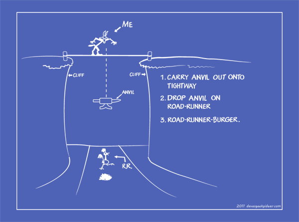
Wile E. Coyote Blueprints Wallpaper
The plan had me at BOOM!
UPDATE: This is now available as a poster you can buy. Check it out here.
Originally this was slated to be part of the Mad Scientist Gear series, but I decided to make these a regular feature. Introducing Wile E. Coyote’s series of blueprints featuring backfiring trap designs.
These will be facsimiles of the blueprints as they appeared in the cartoons. I know they look very clean and simplistic, but that’s how they looked. I’m sure you could add a ‘worn paper’ look to the images easily enough if you so choose.
I would like Warner Bros. to offer these as posters, but they currently do not. For now they’ll do as desktop wallpapers. Or you could go to Fathead.com and get yourself a wall decal. Or you could get some actual blueprints made! Decisions decisions.
Two large sizes and one for the iPhone, click to enlarge:


I will post a new blueprint every so often. Hope you like them!
Spongebob Squarepants Lamp
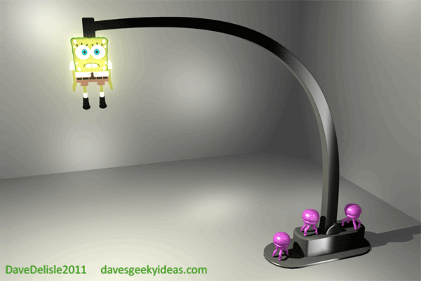
Here is a 3D mockup of a reader idea sent in by Sandra several weeks back. I happened to find a Spongebob Squarepants 3D model in my archive of work, so I thought I’d put this together.
This lamp is based on an episode titled “Jellyfish Jam”. One scene has Spongebob haplessly affixed to a ceiling light by a horde of jellyfish, resulting in light emitting from all of his pores.
That scene also had Spongebob spinning around as a sort of makeshift disco light. That design could work, but I opted for a static pose which is friendlier for everyday use - not too distracting.
Thoughts About Winnipeg’s NHL Team Name
So this will be my last plug for using Mechs as a nickname for the new Winnipeg NHL franchise, as well as an argument for the team returning to their original Jets monicker.
I think Mechs would work on so many levels - it’s badass, modern, different, aggressive, and just plain cool overall. It also pays homage to the Jets name, when acknowledging many Mechs turn into Jets or can fly like one. It’s Jets on steroids, essentially.
The name would move merchandise beyond the core fans of the team. The team mascot and the pregame entrance would be the best in the league!
Mechs would be my personal choice for the nickname if the team were seeking a new identity. Like the majority of fans out there (according to numerous polls and petitions), I’d be very happy with a return to the old Winnipeg Jets name.
The team have a lengthy history prior to moving to Phoenix in 1996, and many fans have carried the torch over the last 15 years for the sorely-missed Jets. The name has become synonymous for heartbreak and symbolic for a large void in the Canadian hockey landscape.
There is a general assumption that True North (owners of the franchise) are trying to milk fans for as much money as possible with a new name. You can’t really fault them for this, they just spent $170M purchasing the team, so any means to recoup that seems reasonable. I’m still wondering why they paid a relocation fee ($60M) as Dallas, Carolina, Phoenix, and Denver did not have to pay one - but I digress. True North paid the big bucks, so if they want to name the team something silly like The Mighty Ducks, they are more than free to do so.
Many also argue to keep the Jets name, but opt for a new logo and jersey style to satisfy True North’s appetite for merchandise profits, which would be a reasonable approach. The current iteration of the logo and jerseys used from 1990-1996 is still modern-looking and passable, but a refresh is long overdue.
Many budding designers have revamped the Jets brand, as the logo wields a lot of recognition and personality. These designs were submitted for numerous sports logo and jersey enthusiast websites over the past 15 years. Even I have engaged in the exercise. The Winnipeg Jets brand has carried so much appeal for designers and sporting enthusiasts alike, comparable to the Nordiques, Rockies, Whalers, North Stars, and many other defunct or retro teams. Often the design exercise was to see how the Jets would look if they were still active, a question which might soon be answered.
Speaking of the Minnesota North Stars, their successor the Minnesota Wild is one example of how a reborn NHL team opted for a new identity which lead to mixed results. A new name was needed, because the old North Stars name was altered to Stars when the team relocated to Dallas. Despite the necessity for a new identity, many fans still attend Wild games clad in North Stars gear. Minnesota had to deal with name similarity, an issue Winnipeg does not have to contend with. However Winnipeg should make note of the fallout Minnesota endured.
The NHL currently owns the Jets brand, and continues to reap all the profits until True North declares they’d like to reactivate the name for their own use. True North better act quickly, as there has been a frenzy for Jets merchandise across Canada.
I wouldn’t mind seeing an extension of the name as long as “Jets” was used in some form. For example: Winnipeg Fighter Jets, which has a Notre Dame Fighting Irish theme to it. Fans can simply shorten it to “Jets” if they’d like (and probably will). Then again, the simplicity of the name Jets has a lot of appeal.
A few of the other candidate names haven’t impressed me as a name that can replace the Jets. Moose seems like a parody of Canadian culture. Can you imagine the Manitoba Moose taking on the New York Rangers? Falcons feels so very high school to me, probably because I attended a few schools with that nickname. However Falcons does carry a lot of historical significance (first Canadian team to win Gold at the Olympics). Bison, Mounties, Warriors, etc. - all names that don’t have the same amount of currency as the Jets. I am very ambivalent about whether to name the team for the city or province, as both are rather funny to read and pronounce. Winnipeg. Manitoba. See?
One thing is for sure, fans will be chanting Go Jets Go regardless of what the team is named when the puck drops in October. And if True North does move forward with Jets, they are more than welcome to use my Mech as a mascot.
EDIT: If they do go with Mechs or Jets, I propose they adopt a Mech as their mascot. The Mech would have many jet parts, almost looking like Starscream. It would have proportions like this:
I think it would look cool to have a ‘walking jet’ serve as the mascot.
Also if I was in charge of the NHL Guardian Project, I would use giant robots to represent teams instead of Superheroes. The robots may not be as unique looking as caped characters, but you could incorporate all the city skylines as the backdrop to giant robot battles.
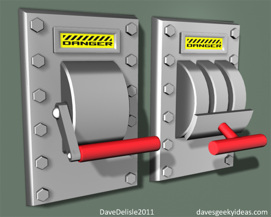
Mad Scientist Gear Part 2: Door Handles
Nothing like an entrance to your evil lair that proclaims “Mad Scientist At Work!” to thwart angry mobs or worse - roommates. I’ve devised a basic solution: valve door handles like the ones found on a Submarine hatch.
This handle gives the impression that there is dangerous substances sealed within. This also could be mistaken for a bomb shelter or a panic room. All three impressions would mess with people actually.
The basic doorknob one is functional, the large one affixed to the middle of the door is for decoration. You could even paint the door silver and glue a bunch of bolts to the perimeter to complete the look.
I was very surprised that the valve doorknob handle does not exist - commercially or as a homebrew device. I figured the Steampunk community would have beat me to it by now. Asleep at the wheel, Steampunkers! Ha. Wheel.
Mad Scientist Gear Part 1: Light Switches
It recently dawned on me that I tend to laugh maniacally and wring my hands just before I hit the ‘Publish’ button for every post, so therefore I must have a Mad Scientist complex. As I began to cope with this realization, I thought it would be best to come up with some ideas that would suit my lifestyle.
So I begin the Mad Scientist series with a pair of light switch designs, both of which resemble an old-school industrial fuse box lever. These simple accessories are often equated to Doc Brown or Dr. Frankenstein, where the act of flipping the switch was the moment of truth - there was no turning back.
At least these would make the act of turning the lights on or off much more dramatic. And I’m all for drama. Now excuse me as I hit the ‘Publish’ button: Mwa-ha-ha-ha-ha-ha-ha!
HE-MAN Blu-Ray Case
Apologies, this box set can look a whole lot better but I don’t have sculpting software and I didnt want to spend too much time on this. I actually set out to do a photoshop mockup with the original toy playset, but no dice.
So here we have a He-Man Blu-Ray case that essentially emulates the original Castle Greyskull toy playset. The toy’s simple clamshell design makes for a versatile box set.
I placed the hinge on the left side (as opposed to the right side like the toy), so the case could open like a book. The only thing that really carries over from the playset is the drawbridge, which would be the door for an enclosure designated for a mini figure (He-Man himself, as seen above).
I didn’t know whether to make the case cartoon or toy accurate, so I leaned towards the toy which increases the nostalgia factor of this design tenfold. I left it as a one-color mold, as the original toy looked like it was attacked by a bunch of crazed airbrush artists.
Apparently the complete series has only been issued on vanilla DVD in 2005-2006, with another DVD release on the horizon. This old 80′s cartoon series probably won’t be a candidate for the HD treatment anytime soon.
Also, I’m a little shocked it took this long for He-Man to grace this blog.
Updated Winnipeg Mechs Design
Thought I’d try and make my Mechs logo I designed last week appear more Robotech than Decepticon. I think getting rid of the blue and red limbs make it look pretty nice on a colored jersey.
Made two versions, one with wings, one without. There are also a few cosmetic differences - see if you can spot them!
I was also thinking, if they do go with Jets as the team name, then this guy would make for a pretty cool mascot. A walking jet. Works for me.
True North has announced they’ll have a team name, logos, colors, and jerseys in place before the NHL draft on the 23rd of this month.
Not only would this team look and sound cool, they’d have the coolest merchandise. I’d buy a Mech action figure with Byfuglien 33 on the back.
One thing I have for going for me - the Transformers films are going strong. The Toronto Raptors took their name from the Jurassic Park films which were the sensation at the time. *Knock on wood*
UPDATE: Bonus Winnipeg Jets style logo:
UPDATE: 3D model of the Mech. Maybe the mascot for the Jets?
Quickie Review: X-Men First Class
Just got back from watching X-Men First Class, and I really enjoyed it. It far and away exceeded my expectations - which were lowered by so-so outings that were X3 and X-Men Origins: Wolverine. This film is the best prequel ever.
It had so many ingredients that I liked, namely James Bond and Batman Begins with a bit of Men In Black thrown in. I refer to MIB because it slickly introduced you to this new world with a plethora of fun reveals, a trait First Class had. The film felt like a great introduction, even if you have seen the previous 4 films.
I think the film falls just shy of perfection. I won’t write one of my ‘Films That Could Be Salvaged‘ posts for First Class because it’s a solid film. But it has it’s faults. [SPOILER ALERT]:
Remember the end of Revenge Of The Sith? Basically a lot of table-setting happened for A New Hope, and that’s what weighed down First Class at the end of the film. I really don’t think First Class needed to be completely molded into the X-Men we know this quickly - I would’ve been fine if many key events happened in later outings.
Magneto in this film was amazing - very menacing and so very human. But he unravels at the end when he suddenly starts holding sermons with dialogue like “BROTHERS and SISTERS…” which worked in the previous films but here it is out of left-field. Fassbender was great, but that dialogue at the end was very cartoony and not really swaying or convincing to me. But somehow it wins over a few mutants.
Dividing the mutants into the X-Men and the Brotherhood, placing Magneto into full garb and Xavier into his wheelchair (making jokes about becoming bald no less) while the latter sets up his new school - was all too much for me. I would’ve been much happier if First Class saved some of those eventualities for later films. Fortunately this all happens in the very late stages after the climax, a sort of forced bookend to what was an awesome film.
And poor January Jones as Emma Frost. She was barely passable in the role, clearly this character would’ve benefited from an actress that could channel Sharon Stone or Michelle Pfeiffer in terms of sultriness and overall threatening presence.
This film does win huge points for actually showcasing the ‘school’ aspect of the X-Men, something that appeared briefly in the prior films, so the title is spot on. Kevin Bacon played a great Bond villain, mixed in with a bit of Inglourious Basterds’ Hans Landa. Sir Michael Ironside also stars, which validates the entire film if you ask me - just wish he had some meaty lines. The cameos were also a huge hit with the audience, and proof fan service can be done awesomely.
A missed opportunity with one cameo (highlight to read): After Wolverine tells Erik and Charles to “leave him alone”, they comply and that is that. However I think it would have been funny if Erik sensed the adamantium and had Wolverine spill his beer as a parting prank. Would’ve been the frat boy thing to do.
END SPOILER. I highly recommend the film, the best Superhero film since The Dark Knight. Also, SHIELD doesn’t appear in First Class, so you know it’s really good.