Video Game Anti-Piracy Ideas Part 2: The Self-Serve Kiosk
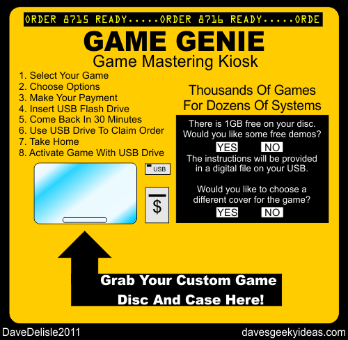
This is an idea that not only addresses piracy, but supply and demand for video games both new and old. A kiosk that makes video game discs on-demand offers a lot of flexibility for the consumers, and plenty of potential for game publishers and mortar-and-brick stores.
First I’ll talk about the anti-piracy measures. If there is one common trait of all packaged video games it’s that they are mass-produced, an army of clones with no uniqueness. Each PC game is bundled with a unique key code, but that is as close to product differentiation as you’ll see for packaged media.
With this kiosk system, no two game discs would be the same. The kiosk would be able to generate unique identifying code for each copy. Anti-piracy could be done in two ways: unique ID markers on each disk which can be traced back to the point of purchase (and potentially the purchaser as well*) if that disc is shared online, which would make everyone very protective of their discs. The second route would be unique code that needs to be activated by a unique key on a USB stick — a tandem needed to play the game. An online check can verify the uniqueness of the disc and key code.
This system would be ideal for new releases on next-gen systems, but can issue older games as well. It’s just the older games would have no anti-piracy measures. Old games would be cheap enough to lure customers away from torrenting.
While these machines would carry extensive libraries, they’d have wait times and some manual work as well, like inserting the cover art into the case sleeve and the disc into the case.
But you’d have options! Maybe multiple games on one disc. Numerous options for the cover art would be available, or you could upload your own.
This takes all the guesswork out of distribution of video games. Have a few of these in the store and you’re all set. No telling customers you’re sold out. No games collecting dust or being moved to the discount bin.
Another thing I’d like to see for this system is pricing options. Your purchased could be subsided by several ads that autoplay once. You could decline a printed instruction booklet in favor of a .PDF file for a few dollars less. Maybe agree to a survey as to why you’re making this purchase. More point-of-sale incentives that will save customers money is always a good thing in my book (better than applying for a credit card to save 10%).
This would also work well for movies and music. Granted, this idea is still a decade late. But if companies still insist on using physical media for next-gen game systems, then this sort of delivery system should be considered.
*Sorry for going Big Brother there. But if you Pirate then you’re painting the bulls-eye on your own back.
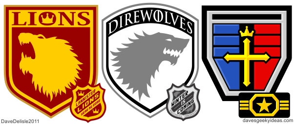
Direwolves 2.0 And Voltron Jerseys Arrived On My Doorstep
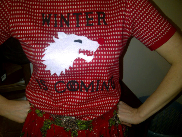
Kim is in a very determined 'Arya' pose as she models her handmade tacky Christmas sweater. It's awesome!
Before I get to the hockey jerseys I just want to show you this picture sent in by Kim P. which features her handmade tacky Christmas sweater. She made a “Rudolph the bloodthirsty Dire Wolf” sweater (based on my Direwolves logo) and a Lannister one based on this logo I made previously. I should say my Direwolves logo borrows from the HBO show - I just turned it into a silhouette and altered the outline. I like what Kim has done with the ear on this logo, may have to borrow that too!
I have already advised Kim to open an Etsy shop and make regular Game Of Thrones shirts like this. You can see the cool potential beyond the intentional tackiness, if you know what I mean.
Sorry for the bad pics. Doesn't do the jerseys justice.
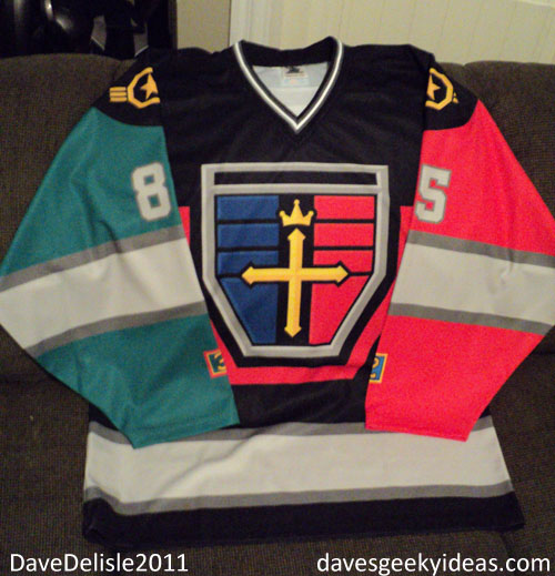
Onto the Voltron jersey! It looks great, front and back. The light grey is darker than I thought it would be, but it does match the shield perfectly. Full disclosure: the arm colors were accidentally swapped from my design, but I saw a lot of Voltrons that had this configuration. My design was based on the 25th anniversary toy.
I really like the shoulder patches, they are perfectly placed. All the little number decals look nice too.
Ghostbusters Hockey Jersey UPDATE: Order Window Closed (Back in September)
The order window is now closed. These jerseys will be back in late August/early September 2012 for Halloween delivery. A smokey-blue variant similar to the Ghostbusters II uniforms will also be available. Maybe a Stay-Puft jersey too? Time will tell. Thanks to everybody who ordered! These will look amazing.
UPDATE: Jerseys were completed and shipped. Go see a completed one here.
Video Game Anti-Piracy Ideas Part 1: The Double-Scanned Disc
This was going to be a lengthy post featuring a list of Anti-Piracy ideas, but instead I have decided to focus on a few of them individually, as they require a lot of in-depth explanation.
This is an idea I’ve had for a long long time, but completely forgot about until I recently uncovered my U2 Achtung Baby CD. For those who are not familiar with the album, the disc featured a colorful and ornate graffiti design, which was rather groundbreaking way back in 1991. Prior to that disc art was black text on a mirror surface - really unspectacular.
That U2 disc inspired an idea where I envisioned the label side of the disc being home to a complex barcode pattern, which would be scanned by a second laser or light scanner stationed above the disc. Now the disc would be read on both sides to activate its usage. To access the data, a confirmation check on the label would be executed.
I can’t fully express the technicality or algorithms involved for such a barcode, but it would be pretty complex. Here is what I would like the disc to feature:
1. The label side is perfectly aligned with the data side. Sure you could reproduce the art on the label side and get it printed on a disc, but to align it with a burned disc? Would be difficult to achieve, as the data side has no visible landmarks.
2. The label side would feature useless “dummy” information, making it difficult for the pirate to determine what the scanner is looking for.
3. The barcode on the label side would be fused with the game title and art, allowing it to be somewhat camouflaged to the naked eye.
4. Each release would have a unique barcode label. This means Call of Duty would have it’s own designer imprint, as would Assassin’s Creed and Mario and the rest. What this means: instead of pirates defeating the platform (the console or handheld itself), they’d have to defeat each disc release.
5. Essential code for the game would be buried within the label. It could be a simple equation (1+1=3 = FALSE), but essential to the continued operation of the disc. There would be dozens (hundreds?) of lines of simple code. This makes the label not just a security measure, but an integral part of the game’s architecture. A super-genius would have to analyze all the code on the data and label side to construct a working game that can function from a burned disc in a modded console. And with lots of vague code on the label side, that could easily turn into a an eternal guessing game.
6. It doesn’t have to be a printed label with a complex pattern. A large portion of the label side could be exactly like the data side. Other readable entities, like hologram stickers, metallic/glossy inks, or glow-in-the-dark ink can be used to create a label that would be difficult to reproduce.
Seeing as how most CD players/drives are dirt-cheap these days, adding a second laser or light scanner to a drive would be inexpensive. It’s too late to retrofit Blu-Rays and CDs, but for the next-gen of consoles (Wii U, PS4, Xbox 720), this could be a viable option.
Cons: People would have to be careful with both sides of the disc. It would be costlier to produce. These would warrant more extensive checks in production to ensure entire batches operate without issue.
Pros: Not 100% piracy-proof (I tried my best), but with a system specific to each disc release, this would ensure a longer time frame for games to be available on the market unabated by piracy. Keeps physical media alive for a little longer!
Note: I don’t believe this is cost prohibitive. I’ll wager the equivalent of a second DVD-R drive is added to the console ($20 in parts max), and the mastering of discs could double in cost from $2 to $4 each. But compare that to what is lost to piracy, and it is nothing. Developing this tech would be expensive. In light of everyone migrating to digital, this solution (or anything similar to it) is too late. I’m still a bit surprised the next-gen consoles are using discs.
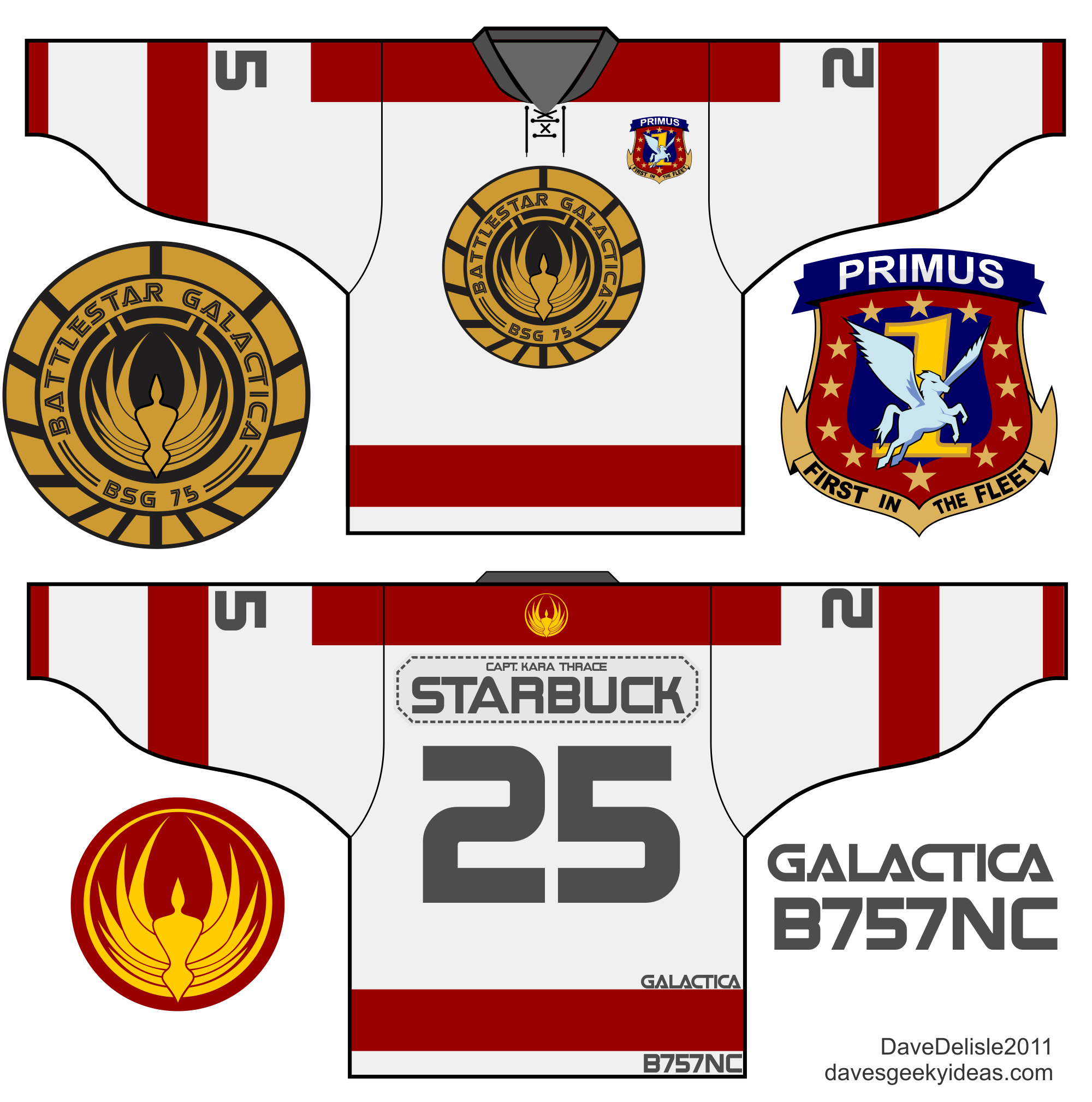
Battlestar Galactica Jersey Design
UPDATE: Now Available until January 19th, 2012. Sorry the item has been removed from the offer, due to legal reasons.
After a failed attempt to make a Princess Zelda jersey for the girls, I went back to the drawing board. Aimed with the goal of making a kick-butt design for the geeky girls out there, it took me mere seconds to think of this jersey, as the words “kick-butt” and “girl” immediately brought to mind Starbuck, BSG’s tough-as-nails-yet-extremely-messed-up Viper pilot.
Initially I made a navy blue with gold trim jersey (and may do that one at a later date) to match the military uniforms of Battlestar Galactica, but then I felt a design modeled on the Viper Mark II would work better. Not only did the red striping translate well to a hockey jersey, but this allowed me to use the call-sign banner (located by the cockpit) for the name plate. I also got to implement the squadron logo and gold BSG logo markings seen on the Viper.
To complete the look, I added Starbuck’s Viper tail number to the tail of the jersey. Sadly it doesn’t get much more brilliant than this here at Dave’s Geeky Ideas.
Originally the Primus 1st Squadron logo was the primary front crest, but that Pegasus kept bugging me to no end. I also felt it might offend some girls, despite it being the actual squadron logo. The logo is parked on the front nose of the Viper and is barely visible, so I decided to make it a small patch instead.
Confirmation Of Hockey Jersey Orders Sent
I just sent an e-mail confirmation to everyone who ordered a Stark Direwolves, Lannister Lions, or Voltron jersey from this recent offer.
If you placed an order with Rinkgear and made a payment, and did not receive this confirmation e-mail from me, get in touch with me as soon as possible through my e-mail: [email protected]
Hockey Countdown Lights
This is a set of five lights stationed behind the net near the top of the glass that would countdown the last 5 seconds of a period or the last 5 seconds of a penalty. This is similar to a shot clock in Basketball, but only used in the two instances described. These would be situated behind both nets, and act in the exact same fashion. Read the rest of this entry
Zelda Hockey Jersey 2.0 Design And Future Jersey Plans
UPDATE: Now Available until January 19th, 2012.
Just putting the finishing touches on this Zelda design (well, Link actually), in what is the next hockey jersey to go on sale (along with this Dr. Who Tardis jersey). As you can see, it is a big improvement on the first Zelda design I posted. That lace collar is so apt. Green is Link’s uniform color, anything else would be weird.
Still trying to figure out a way to place the Ocarina on the jersey, but it might not be necessary. I could do a shoulder patch, but truth be told I’m not big into shoulder patches. I like simple jerseys free of clutter - original six style. Read the rest of this entry
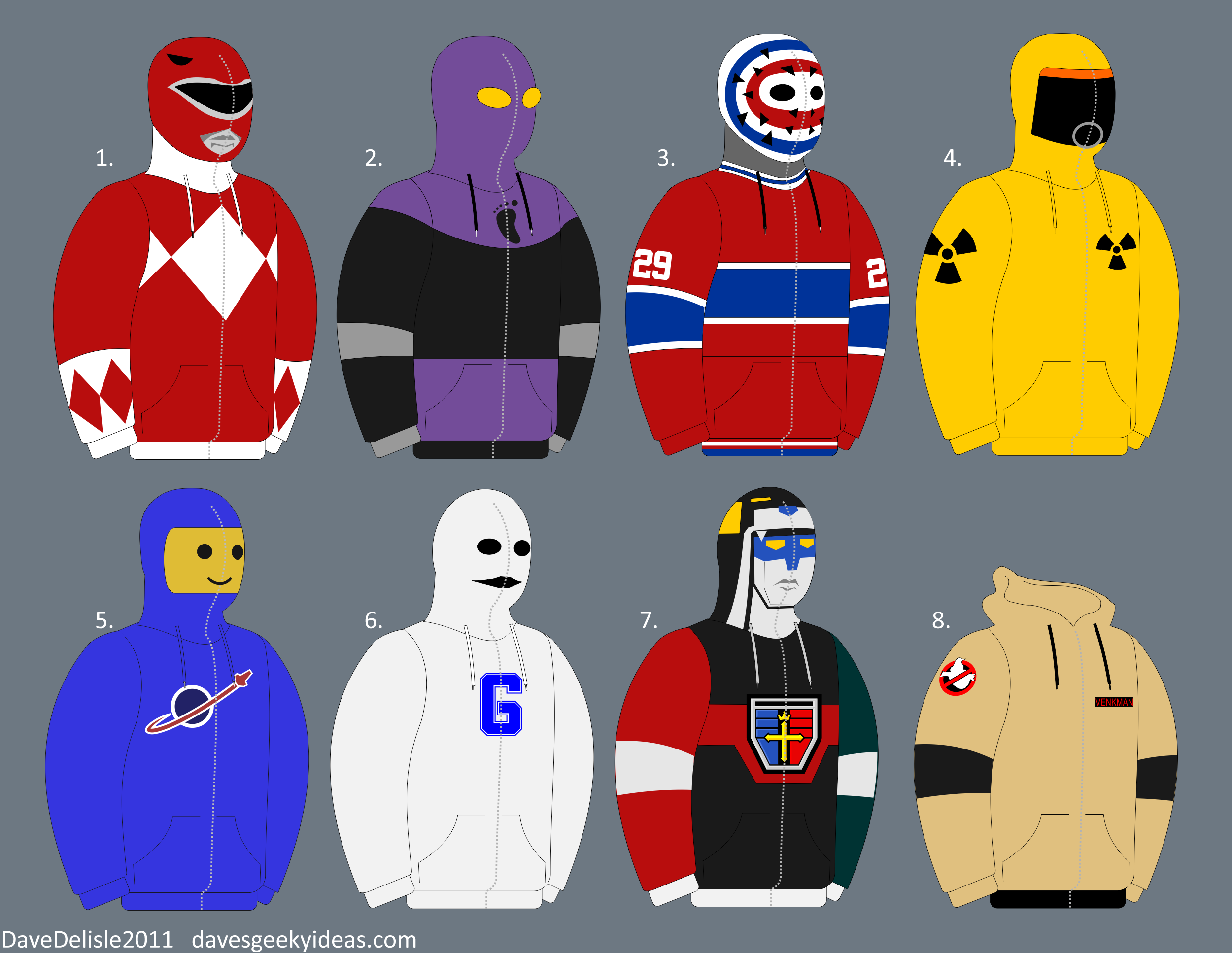
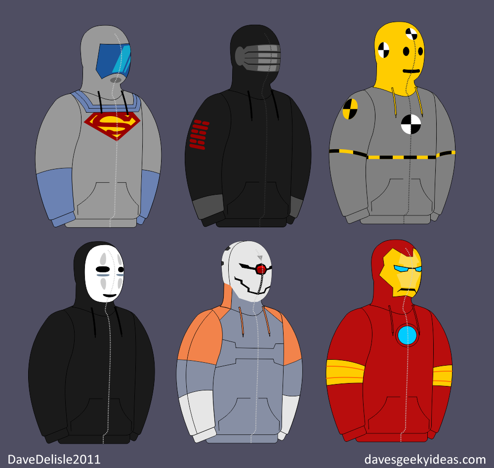
Geeky Fashion Part 4: Full-Zip Hoodies
Compared to the previous three entries in the Geeky Fashion series, there are plenty of geeky full-zip hoodies (hoodies that zip all the way up to cover the face often forming a mask), but I want to submit these design ideas, which as far as I can tell do not exist yet (feel free to correct me). Some of the more obvious choices, like Spider-Man or Star Wars, have already been done.
Designed these based on what I want to wear, and as usual I kept the designs simple (just like me). The ones I see currently on the market are a bit too busy or skewered towards the kids. The ‘skull’ design looks cool, but it’s not very fashionable for everyday wear.
All of these full-zip hoodies would feature plastic lenses for the eyes to see through. The windy/rainy days I’ve recently encountered made me wish for hoodies like these.
I won’t name them, I figure they are pretty self-explanatory (Commenters feel free to list them). The third one is a general ‘hockey goalie’ design, and could be applied to all NHL teams. The last one, well, I tried to do something with headgear/goggles, but it didn’t look right. Makes for a cool regular hoodie, if I may say so.
UPDATE: Here are a few more.
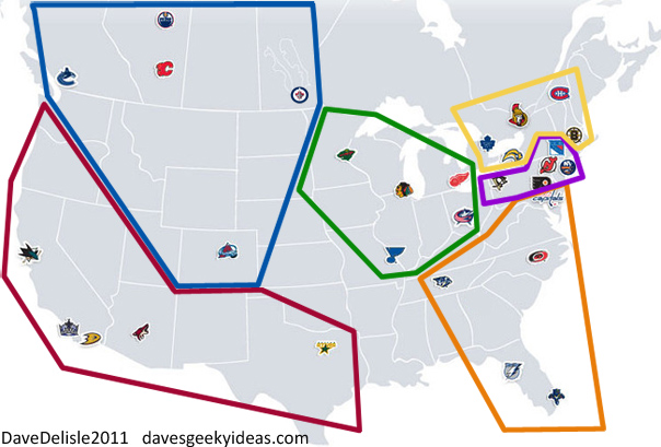
My NHL Realignment Plan
Because the Atlanta Thrashers relocated to Winnipeg to become the Jets 2.0 this past offseason, there will be a new alignment the NHL to start the 2012-2013 season. Above is my proposed alignment for the divisions. Read the rest of this entry

