Blog Archives
Nintendo Hockey Jersey
It seems to be pouring hockey jerseys and logos here lately - and it’s the middle of summer! I seem to be a streaky blogger - only a few weeks ago I had a ton of Looney Tunes posts.
This one was simple to throw together - a Nintendo 64-themed jersey. Of all the gaming systems, this was meant to be on a hockey sweater. Many other systems either lack a comparable numeric naming convention, or a decent logo that can double as a crest.
This post is a knee-jerk response to Detroit’s newly-acquired defenseman Mike Commodore, who may wear number 64 this upcoming season, giving him the ‘Commodore 64′ designation. The internet wants this to happen. I’d like to see this as well! But Mikey - why didn’t you do this when you were a Calgary Flame?
If I could add one thing - a waist stripe. I used San Jose’s third jersey for this image, so I couldn’t throw one on there. I say this because right now it looks like a football jersey.
Game Of Thrones Hockey Jersey: The Lannisters
Click HERE to see the Starks’ Direwolves jersey.
This entire post is a series of apologies: Sorry for re-using that Lion logo I posted last week - It just seemed appropriate. Sorry for referring to “A Songs Of Ice And Fire” as merely “Game Of Thrones”, a clear indicator that I am a new fan. I wear my noobness proudly.
Sorry to my favorite team the Calgary Flames, for using your 2011 Heritage Classic jersey as the template for this Lannister design. I don’t mean to vilify or besmirch the Flames, the color scheme just worked with the Lannister gold and red.
Sorry this photograph sucks. No real decent high-res images of this jersey available. Sorry for not using the full-bodied ‘prancing Lion’ motif, it’s been done to death. Sorry for the inclusion of the crown in the logo, as I am currently 2/3 of the way through A Clash Of Kings, so to me that brat Joffrey is still King. Do not write me with spoilers.
Yeah that pretty much covers it!
BONUS: A variant that is…goldier, and has the word ‘Lannister’ in a…burstier state:
Got a request to see the name separate from the Lion (similar to the Stark design):
Add More Seats To An Arena Part 2
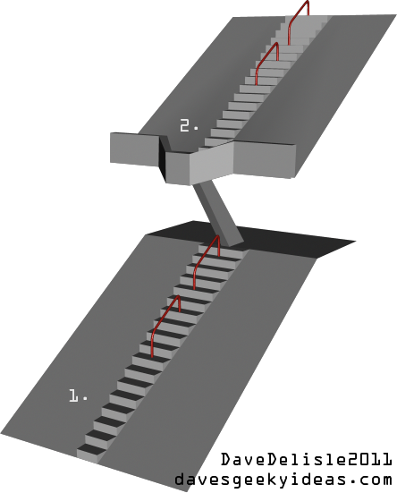
Over a year ago I suggested that additional seats could be added to an NHL arena by installing a system that would hydraulically lift a section of seats, allowing the Zamboni to pass through.
This time I won’t suggest anything as drastic:
1. Taper off the stairs as they reach the bottom (or top of the nosebleeds) of the section, because let’s face it - not everyone is sitting in the front (or back) row. Not only would this allow for more premium seats, but provides a staggered seating arrangement, meaning you won’t be sitting directly behind the person in front of you. Dwindling down the staircase width from 2/3 persons wide down to one person wide at the bottom is optimal.
2. Install little balconies on the upper deck of seats that are directly above the stairs. This will only impede the vision of those standing in the concourse or at the top of the steps, and only if they are trying to take a gander at the scoreboard.
Other ideas not pictured:
3. Adaptable seating: If a luxury suite is not being used, close up access to the suite, and open up a few rows of seats for the public. These seats would be merged with the general seating bowl, so fans would get to the seats via the stairs in the bowl. This could also be done for the press area.
4. Okay this one is pretty out there - a “sky bar” built into the main scoreboard. It would feature a glass floor and outer glass perimeter to watch the game. This would essentially be like watching a game from the moon in The Truman Show! The scoreboard would have to be bigger, and need to be somewhat soundproof as all the arena speakers are located adjacently. I don’t see this being a seating area, but a bar or pub venue.
If you think all of these ideas are a little crazy (I wouldn’t blame you one bit), here is something to check out: They are installing a sky bridge at Madison Square Garden. Really.
Game Of Thrones Hockey Jersey: The Starks
(Aug 1/2011) ****MAJOR UPDATE**** Want to buy one? I’m putting together a group purchase for this jersey. Please visit here for details. See image at bottom of post too.
(Nov 9/2011) UPDATE 2: The Direwolves jerseys are back until Nov 17th. A Lannister jersey is also available. Check out both here.
Click HERE to see the Lannister Lions jersey.
Lately I’ve been held hostage by all things Game of Thrones. I took a moment to step back and realize all these different Kingdoms could be represented by sports teams. They each fly a banner bearing a sigil, usually depicting a fierce animal - much like a typical sports franchise would.
The above example shown is the Direwolf, which is emblematic of the House Stark. The Starks reign in the north, and their (foreboding) motto is “Winter is Coming”. To me it all screams hockey.
You could probably design several hockey leagues based on the huge number of banners in the Game of Thrones books, though only a few are prominent. The aforementioned Starks are the main protagonists. The evil Lannisters (I may be editorializing a bit) have the sigil of the Lion. The Targareyans fly the banner of the Dragon. Like Milwaukee, the Baratheons are represented by the Buck.
I know I frequently design hockey jerseys here, and you might think it’s because I’m Canadian and thus have a one-track mind. The real truth is hockey jerseys are a brilliant canvas on which to showcase a team’s identity. That logo on the chest is like a Superhero insignia. No other sport has a jersey or uniform where the team logo can be so prominent. EDIT: A friend tells me these would look better on a “football kit”. Well I say good day to you sir. GOOD DAY.
EDIT: Got an email from Mark, who says the Stark sigil is a full-bodied silver Direwolf on a white background (white = ice/snow), and that the Baratheon sigil is the Stag, not a Buck. My bad. I won’t make a full-bodied Direwolf, but I’ll fix up the logo a bit:
Bonus art! Using the Tampa Bay Lightning royal blue alternate jersey:
I will design jerseys for the other Game of Thrones Houses eventually, stay tuned!
Now you can order one! Go HERE for more details, or email me with the subject line SHUT UP AND TAKE MY MONEY, and I will send you some information.
Grand Rapids Griffins Contest Submission
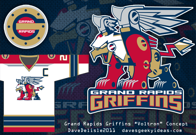
For the last few years, PuckDrawn and the Grand Rapids Griffins (AHL) hold a competition to design a hockey jersey worn for the team’s annual New Years Eve game. The jerseys are worn once, then auctioned off for charity.
I decided to make a Voltron-style Griffin logo, with a team jersey that resembled that robot somewhat (red arms!). Teams in the AHL wear white at home, a major design consideration here. I think it looks great - very Florida Panthers-like.
And yes, I am well aware of my obsession to see a robot on a sports jersey. This time it’s a coincidence, as I merely wanted to portray the team mascot with a different take. Really.
Backseat Designer: Trains, Hockey Trinkets, And Transformers
I’m not an expert in design, nor do I enjoy being a critic - I tend to only review things I like! But here and there I see things that I feel miss the mark, so I will offer my two cents and offer insight as to how I would go about it, given the opportunity.
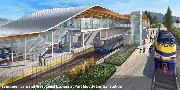
First up we have this rendering of a train station for the upcoming Evergreen Skytrain route that will be built in Port Moody and Coquitlam. It’s a very pretty station, much like the ones that have been built for the recently-opened Canada Line and the not-too-old Millennium Line.
What I take exception to is the absence of environmentally-friendly solutions that could help make this train self-sustaining. Where are the windmills? Where are all the solar panels? Instead a lot of greenery to give the impression this is an earth-friendly facility.
This is a design trait I’ve come to think of as a priority these past several years, ever since one single piece of architecture design really wowed me: a proposed Walmart for Vancouver. Yes it’s a bit disturbing for me to give accolades to Walmart, but when a big box retailer is taking the initiative municipal governments should be leading in, you have to give them props. Here is that Walmart (which was never built):
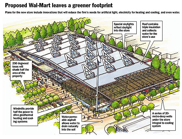
As you can see the additions of windmills and solar panels will not uglify the station(s) one bit.
But it’s not about aesthetics, it’s about common sense. If you’re running a mass-transit system that consumes a lot of power, wouldn’t it make sense to implement these power solutions?
Plus this train line is called the Evergreen line. It should aspire to live up to it’s name somewhat.
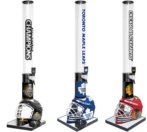
Next up are these hideous NHL beer taps I saw on Puck Daddy a few days ago. As a hockey fan who indulges in the odd team memorabilia, I suffer facepalm-itis whenever I visit the NHL store (or other online sports retailers), because the catalog is packed to the brim with ill-conceived products. It’s slightly maddening because all this junk gets the green-light, and I can’t even get one semi-decent idea made.
You can read the article at Puck Daddy to see what they thought this product reminded them of - I won’t mention it here! But to me it looks like crap.
Here is what I would have done if asked to design a beer tap featuring an NHL license: A Zamboni covered with team logos that featured a pop-up lid (like a BBQ) revealing the tap and place to sit your cup. Need it vertical in design? An empty team locker (with a few player items) complete with a bench to park the drink cup. How about a replica Stanley Cup to pour drinks from? Maybe a rack of hockey sticks sitting together? Argh.
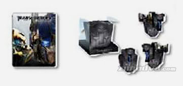
Lastly we have this peek at the Blu-Ray release for Transformers Dark of the Moon, slated for this fall. It will have the DOTM film as a solo release in the standard amaray case, and the trilogy in a ‘Transforming’ case depicting the Autobot emblem. Sorry for the small image size, it is the best I can find.
I’m beginning to think I’m the only one who took something away from Tom Hanks’ boardroom critique of the transforming Chrysler building in the film Big. How is this fun? Where is the appeal? It’s an Autobot faction symbol with gullwing doors. What. The. Heck.
I don’t mean to pimp my design, but it had a lot of things going for it: A. Comes with a figure - a triple-changer no less B. The actual case transforms into Optimus Prime’s trailer, making it a useful addition to Prime. C. It looks good on the shelf, unlike this dejected-looking faction symbol drowning in a tar pit.
I’m not saying my design is perfect either, but it demonstrated some versatility and is a nice extension of the both the toy line and the films.
Also, after the mixed-reception of the Halo 3 Legendary edition and the ‘Neo Bust’ Matrix Collection, I would never design anything head or bust-like for a collector’s edition. You don’t need a media package staring blankly at you from the shelf.
Well that’s my $0.02 for now, I will write one of these posts when missed opportunities present themselves (as much as they try to hide).
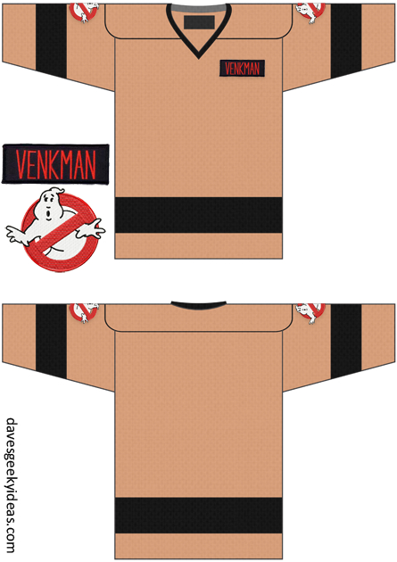
Who Wants A Ghostbusters Hockey Jersey?
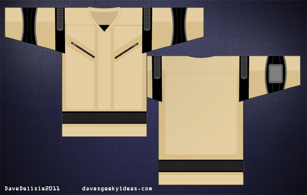
I’ve been wanting a Ghostbusters hockey jersey for awhile now, the thing that has repeatedly stopped me: no one makes a khaki-colored jersey.
I recently stumbled onto this company called RinkGear (via PuckDrawn) who can output entire jerseys using a sublimation process, so you can put whatever you want on it.
Right now they are offering jerseys for $50 a piece (regular $60), plus shipping of $3-5 per jersey. However they need a minimum order of 10 jerseys. So I need (at least) nine very cool people who love Ghostbusters to join in on this offer.
I’d like to guarantee you it will be $55 for your jersey, but logistical factors could increase that cost. If Rinkgear or myself has to process numerous payments and individual shipping orders, it will probably cost more. We might also miss the sale window and be charged regular price. If you live outside of North America, it will cost you a lot for shipping.
We’ll also need to come to a consensus as to what the jerseys will look like. Right now I’ve got shoulder straps (for the proton pack) included on the jersey. I could add the nameplates (Venkman, Spengler, etc.) and Ghosbusters shoulder patch logos, but my recommendation is to separately order the embroidered patches online and affix them to your jersey. Would look so much nicer, plus you can choose your favorite nameplate. The 4.5″ GB logo patch is ideal for the shoulders.
So to get started, send me an email detailing your name, general whereabouts (no exact addresses needed right now), your preferred means of payment (paypal, credit card), and any feedback you’d like to see in regards to how the jersey should look. I will then create a mailing list and BCC everyone from there.
After we get enough people, we’ll hammer out the design and logistical details (payment, shipping). The design will be by committee, so if you’re unhappy with the direction you can withdraw from the group. Hopefully we’ll still have enough people to move forward with an order!
This is the first time I’ve put something like this together, so there will be growing pains and I ask for everyone’s patience! In the end you’ll have a cool GB jersey, and hopefully all the back-and-forth emails will be worth it.
Here is another concept, with patches:
Los Angeles Kings Logo Concept
This isn’t a post where I make a case for what the LA Kings should look like. Rather I am posting a logo of what I thought they looked like.
First a brief history lesson:
Back in the mid 90′s (1996, I reckon) the NHL launched it’s alternate jersey program, allowing teams to wear alternate jerseys for a portion of the regular season. Prior to that teams did not use alternate jerseys, except for special occasions. Five teams were chosen to usher in this program: Vancouver, Anaheim, Los Angeles, Pittsburgh, and Boston. The results ranged from decent to disastrous.
The Pittsburgh Penguin’s futuristic-looking jersey (bottom) was a fan-favorite, and showcased the use of sublimation, allowing for gradient graphics. It was bold and viewed as the sign of things to come for the NHL heading into the new millennium. The jersey was a hit, and was promoted to full-time use as the team’s road jersey. The jersey had a 7-year run.
The Vancouver Canucks also had a sharp-looking third (bottom), despite echoing the colors of the rival Calgary Flames. If not for their complete overhaul that brought in the Orca logo, I imagine Vancouver would have used these for a few more years.
The Boston Bruins went for a very bizarre jersey (bottom) that was gold in color, had a vague bear head logo and buzz-saw striping. Of the five teams, this third jersey was the middle of the pack design-wise. However it lasted the longest, seeing service for 11 years until the team retired it in 2006. Impressive, considering how these last two jerseys fared.
The Los Angeles Kings and Mighty Ducks of Anaheim had jerseys that would last only a few games. Anaheim went with the infamous ‘Wild Wing’ jersey (bottom), which depicted a cartoon character from a TV show that Disney had just launched. Los Angeles didn’t fare much better, releasing the equally infamous Burger King jersey (middle), so named because the logo bore a striking resemblance to the BK mascot. Both jerseys were ridiculed by fans and players, prompting their quick retirement.
So back to my logo design!
If I recall correctly, all five alternate jerseys were launched on the same day between 3 games. One game paired LA and Anaheim as they both debuted their ugly jerseys. I did not see the game broadcast live, only the highlights later that evening. The sports telecast I was watching briefly showed the logos being adorned by the two California teams.
And in all honesty I thought the LA Kings logo was a Lion head. They showed the logos so briefly, and I believe the Wild Wing logo preoccupied most of my viewing time. So as I was letting these logos sink in I thought: that Lion logo is a very cool idea! It’s regal, it’s royalty, it represents the KING of the jungle! Genius. But then they showed the game highlights, which had prolonged shots of these jerseys, and I soon became horrified. Not only was it not a Lion logo, but an angry man King on a very ugly jersey. To this day I can remember Wayne Gretzky looking somewhat dejected being seen in it.
So long story short, I thought I’d draw the logo of what my first impression was. I’d like to say it works much better than the actual King logo they used, but I’ll let you be the judge.
A Walking Jet Mascot For Winnipeg?
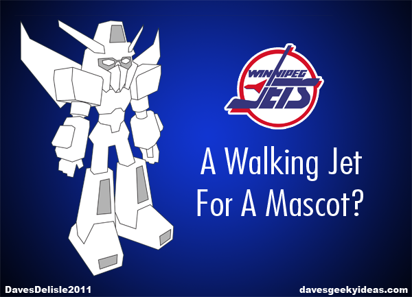
This is something I touched on in previous posts with my Winnipeg Mechs design, but I thought I’d write a dedicated post now that the Winnipeg team is going with Jets as their name.
True North Sports and Entertainment, the owners of the Winnipeg Jets, admitted to wanting to forge ahead with another name, likely using Manitobe in place of Winnipeg. This would have been a fresh start for the franchise. It also would be a burgeoning revenue stream as fans would have needed to get new jerseys and merchandise that reflected the new name.
Fortunately TNSE went with the ‘Winnipeg Jets’, and will likely do a lot of business when they unveil their new logo and jerseys later this summer.
One revenue stream that could be very lucrative is a line of merchandise based on the team’s mascot. Especially if that mascot was a robot along the lines of a Transformer or a Gundam - a walking jet. The possibilities for merchandise would be ten-fold compared to a typical mascot.
A line of toys, comics, and other products where robots can reside (practically everything) would be a huge revenue stream, especially if the mascot’s design was well-executed. You could even forge a large back-story with many other characters to expand the line.
Some of the toys would be pricier to produce (like a transforming robot), but not impossible. I’ve seen many toys that incorporate NHL licenses, and these are sold at a premium. A Winnipeg Transformer would be no different.
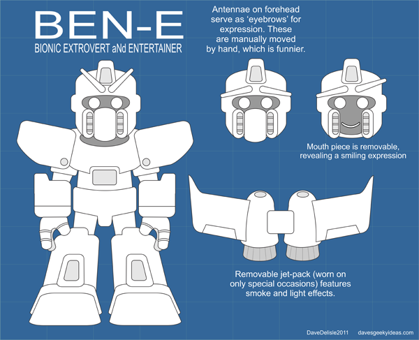
In the past the Jets used “Bennie”, a dog named partly for the owner and that famous song by Elton John. Nostalgia may resurrect Bennie, but he was a generic animal mascot. Using a robot mascot would be somewhat unprecedented and would have much more consumer appeal than a dog. As a compromise the robot could be named BENN.E!
If the team really wanted to knock it out of the park, they’d license Starscream from Hasbro as their official mascot. Not only is the character well-known and has a huge following, but he sports the colors of the Winnipeg Jets too. This would be pricy, but he’d be the coolest mascot in all of history.
In summary, I nominate a walking jet robot to be the mascot of the new Winnipeg Jets. The possibilities for this mascot are astronomical.
UPDATE: here is a basic mascot design. He would normally feature the team colors and logo (which have yet to be revealed), which is why he is plain:
Second Winnipeg Jets Logo Concept
Yesterday it was finally announced: the new NHL team in Winnipeg will indeed be called the Jets. No logo or jersey has been revealed yet, only the vague description from the owners that the logo and color scheme will be familiar.
I thought I’d take another crack at the Jets logo, now that it has been made official.
I’ve always been a huge fan of simple logos that use a single letter to represent the city or team. This approach is common in Baseball, though there are teams in hockey that utilize this style to perfection. The Montreal Canadiens and Boston Bruins are perfect (and timeless) examples. The Flyers, Canucks, Avalanche, and my favorite team the Calgary Flames also use this style for their identity.
With those team logos in mind I crafted this ‘W’ logo, which was formed by two Jets’ vapor trails. It made sense to use two jets, the name being plural and to represent two different eras of NHL hockey in Winnipeg.
This could work as the main logo or even a shoulder patch. I personally like the simplicity, and how you can see the ‘W’ from afar, or even in a small thumbnail.
Here is a more “italicized” version:
A couple of more variants, one featuring a ‘J’ as well. Very New Jersey Devils-like:
Here is a request to see a single plane doing the ‘W’ loop-de-loop. I also thought I’d try one with text, which looks good, but the NHL has been doing it so much these past 5 years! Ah well. Here they are:
New! (July 14 2011):