Archive for January, 2011
If I Designed The Packaging For The Nintendo 3DS And/Or Sony NGP
With two major portable platforms releasing this year, the Nintendo 3DS and the Sony NGP (Sony’s Next-Gen Portable, aka PSP2), I thought I could help out with an innovative solution that will help save these two Multi-Billion Dollar Companies some money.
That solution? To cut their packaging size in half.
Why? Because both platforms use tiny little memory cards stuffed into a large plastic snap case. I present into evidence ‘exhibit A’:
It doesn’t look too bad here because this case is housing 2 cartridges - one for the Game Boy Advance slot. Alas the 3DS is not backwards compatible with the Advance, so there is no more placeholder to park GBA carts.
Anyways, it’s a lot of packaging for a tiny little cartridge. This is done for two reasons: first and foremost for product visibility on the shelf, and secondly for security. Having a small package makes it easier to overlook, and also more prone to theft.
So I thought I’d devise a solution that has the same amount of visibility with half the packaging.
As for security that is handled efficiently by retailers. They will keep the games behind the counter, in a locked display case, or packed in a theft-proof container, like this:
Looks pretty secure to me. These trends will continue with the 3DS/NGP, so my package design will conform to these. And if you look above, you’ll see my design contained therein.
So where is the innovation? It’s rather simple actually. I made a smaller case that is displayed in a wide open state until the User purchases it. Then he/she snaps it closed.
It might seem silly at first, but think of it - you have this front face that showcases the game and at the same time, provides all the essential info, like screenshots and the story. You no longer have to pick the game up to read whats on the back, it’s right there in front of you. This is so helpful for when the game is locked behind glass.
I put all the essential stuff on the front, which takes up about the same amount of shelf real estate as a current DS package. This retains visibility.
I put all the legalese and fine print and other unwanted clutter - like the bar code - on the back. I even put the basic instructions there - which is what I think all games should do. Who reads instructions anymore? All this is visible because my case uses clear plastic.
This really frees up the front of the case design-wise, providing a cleaner look. All the junk is tucked away.
You could add an instruction booklet I suppose - I would tuck it into the outer liner. Again these aren’t necessary in my opinion.
After you buy the game, you snap it closed, and you get a very compact case. It no longer has to sell itself, it just needs to store your game when you are not playing it.
Some retailers could choose to sell the game in a closed state if they’d like.
I designed this package to be 50% smaller. Not only is everyone saving some money right down to the customer, but this is beneficial to the environment. It’s good that cases are a permanent item you keep (as opposed to the old days of the disposable cardboard box), but with the cartridges being so small, it is overkill.
Here is a size comparison:
2 comments January 30, 2011
Star Trek View Screen LCD Monitor - A Practical Exercise In Branding
They are wondering when the sequel is gonna happen as well.
Several months ago I designed a ‘Star Trek View Screen‘ gadget that would accommodate any LCD monitor or TV. Then I recently thought this feature could be directly embedded into the LCD monitor itself. And voila.
Wouldn’t be too hard to make a matching remote…

Ideally, you could switch the lights off. I also wouldn’t mind having those BING! BING! BING! sound effects included as an option too.
This idea just seems well, logical (pardon the pun).
In my lifetime I have seen many brands stamped onto products, most notably with cars. We recently had a Call of Duty Black Ops Jeep. A few years back, Ford issued Eddie Bauer SUV’s. After a brief hiatus, Ford has resumed issuing Harley Davidson trucks this year. Yes you read right, Harley Davidson trucks.
Other memorable offerings: Whistler/Blackcomb edition Chevy trucks (a ski resort?), as well as GM offering Olympic-styled vehicles (with vomit-inducing gold hubcaps) during Calgary ’88. Blech.
So why not a Star Trek-branded TV or monitor? It’s a seamless fit. Samsung, Sony, LG - please make it.
Other cool TV’s: Inspector Gadget Dr. Claw-themed monitor. A Matrix-themed monitor held up by pipe fixtures. An egg-shaped screen like the ones seen in Men In Black.
Add comment January 29, 2011
Transformers Trilogy Blu-Ray Package
I finally got this one finished, not because it was difficult, but because I kept getting side-tracked.
As you can see, it is a Blu-Ray box set that turns into Optimus Prime’s trailer, which would be compatible with a Voyager-sized Optimus figure. If you’ve been keeping track of all my updates, than there is nothing really new here, except the completed box art.
It opens on top with two flaps to get at the movies. The movies are packed in three normal-sized Blu-Ray jewel cases. These can stay in the case, regardless of mode and during transformation.
All the extra parts, like the hitch/weapon and the Roller figure (and his weapon) are stored inside the case too. They’d fit into the gaps adjacent to the jewel cases:
The back gate has a double hinge, so you can fully open it to get at the movies, or to form a ramp for vehicles, if you want to store those instead. There are ledges on both sides in the container for a car to park:
The hitch underneath turns into a ‘Bow’ weapon for Optimus to wield. This also helps park the trailer.
And of course the package comes with ‘Roller’, who is clamped onto the front of the trailer. He can convert into a car with a mounted cannon, and has a robot mode too. He is about the size of a Scout class figure. You can see and read more about him in this post.
I’m sure Hasbro would make a final product look a lot nicer. To truly make this a success:
- Only include the Dark of the Moon film. Everyone already has the first two. I’m not a fan of double-dipping.
- Provide the Optimus Prime figure as well. I see them go for about $35CDN, so I wouldn’t mind buying the Trailer Case + 1 Blu-Ray film + Optimus for $100. That seems fair.
- Make this a collector’s item. I think a run of 100,000 would be ideal.
Anyways, here is hoping Hasbro, Paramount, and Dreamworks decide to issue something cool like this, as opposed to, well, these (bottom of post).
4 comments January 29, 2011
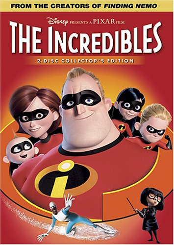
Incredibles Blu-Ray Release Underwhelms
This is the box art for the upcoming Incredibles Blu-Ray release. This was shown as part of the Amazon pre-order listing (The film will be released April 12th).
I’m happy the film will finally bow in HD, despite being in a vanilla jewel case. I personally favor those special edition cases (I even designed one for the Incredibles), but a Blu-Ray release is a lot better than no Blu-Ray release at all.
But why oh why is the art on the package a Photoshop mash-up? And a bad one at that? Mr. Incredible looks like he is in another time zone (and the only one not making eye-contact). Dash’s ‘speed blur’ is just distracting and breaks up the layout - looks like a fog broke out. Violet looks garbled, lost in a sea of black gloves.
Disney and Pixar have many extremely talented artists in their employ that could come up with something new and original. A team from Pixar could take the original models from the film, pose them, light them, and render something cool.
As far as I’m concerned, this doesn’t even compare to the original DVD release.
It’s a few months away. I hope this is just an Amazon mash-up, not something the house of mouse would issue.
2 comments January 29, 2011
Good Will Hunting Painting Update
So I fixed it up and removed my signature/website because it wasn’t my painting. Apologies to Gus Van Sant, who painted the original.
Click to enlarge:

2 comments January 29, 2011
LOTR/Hobbit Blu-Ray Update
Another update. Thought I’d include a LOTR variant this time, and arch the text. I also made the door knob larger and gave the green side of the door some wood grain.
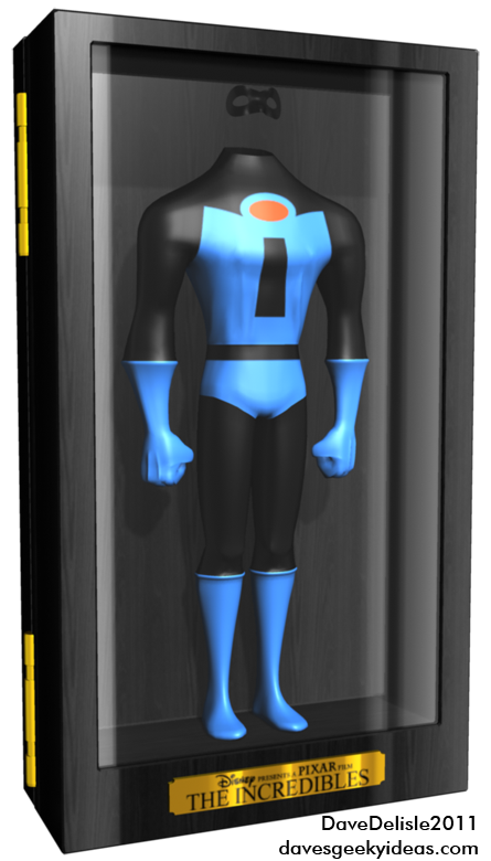
And if you didn’t catch it, I also updated the Incredibles Blu-Ray case so that it is more colorful and overall more visible than the original depressing version:
1 comment January 29, 2011
Ideas For HOUSE M.D.
I really enjoy the show House. It has many ingredients that make it worthwhile - the acting, the dialogue, the interaction between characters, and lots of conflict. Conflict is so crucial because without it everyone is one big happy family - something my favorite show Eureka is guilty of.
The show has devolved in a few ways, and that tends to happen after several years on the air. The writers are forced to tell more ‘exotic’ stories, or tell familiar stories with gimmicky devices (like through the eyes of a comatose patient).
The show also went and paired up House and Cuddy, hoping their relationship will pay off story dividends.
And despite a few standout episodes, like House being committed to a Psych Ward to start Season 6, the show is just stuck in a rut.
Some ideas for House:
1. Use syndication to your advantage. With older House episodes in heavy rotation (and that’s how I got into the show, btw), it wouldn’t hurt to revisit characters or events from years gone by. It could be a returning patient that has the team second-guessing their initial treatment. Maybe an old adversary of House needs treatment (e.g. Detective Tritter). I’d like to see House’s ex-wife (the lovely Sela Ward) return, maybe some of the candidates that competed for House’s team in season 4, like “Big Love” could make an appearance. Could we also resolve that ‘escaped gunman’ fella from the Season 2 finale?
2. House needs to get out of his comfort zone. Princeton Plainsboro is House’s territory, and that is where he roosts. Put House in a different environment where he has no leeway or power and he will NOT be happy. This could be a temporary transfer to the Emergency Ward at a nearby hospital, for example. Or he could be sentenced to treat inmates. Something.
3. House needs a rival. He’s had adversaries before, but a true intellectual equal that might threaten to usurp House’s position. This would threaten and intimidate House and perhaps get him to doublethink and second-guess himself. Sherlock needs his Moriarty.
4. House needs a new new team. I thought one of the boldest things I ever saw on TV is when House eliminated his original team of Chase, Cameron, and Foreman, and sought to replace them. He did, but the original team just lingered around, and eventually Chase and Foreman returned to being full-time members (Cameron was briefly as well). This being a teaching hospital, it completely made sense to have a revolving door of team members. However the continued presence of Chase and Foreman (as likable as they are), just breeds familiarity. The highlight of season 7 is adding Martha Masters (Amber Tamblyn), and seeing her exposed to House’s antics - rather refreshing.
Plus Chase and Foreman seem like groupies now.
EDIT - I’ll update this post when I think of some new things.
Add comment January 28, 2011
Kids These Days! And Much Ado About Retro Cola
I brought this home, and was holding this above my door when I called out to my twenty-something roommate “Hey check this out!”
She asked “What is it?”
“It’s…it’s a sign. Well, a piggy bank of the Ghostbusters sign. You never heard of Ghostbusters?”
“No. What are they?”
“80′s film. *Sigh!* You need more culture!”
Ghostbusters 3 can’t get here soon enough. The world needs to be reminded. The younger generation needs to be saved from this Twilight stuff ( the roomie is a Team Jacob fan - whatever that is).
Anyways I bought this piggy bank, which measures 9″ x9″ x 3.5″ for about 30 bones, which is 1/12th of the cost of a Ghostbusters light. It’s from Diamond Select, and I highly recommend it. I’m going to buy a shelving bracket for it to sit on.
It appears to be hand-painted, so it’s not perfect - but nothing I can’t touch up. Or perhaps I’ll bug my friend Mr. Rose to touch it up. He can paint those tiny Warhammer figures with such precision - such a masochist, if I may say so.
One cool thing is if you take the coin slot off, you can insert a light and the red portion of the logo will be translucent to light. Not too shabby.
Speaking of 80′s things, I picked up a bottle of Retro Pepsi, which is made with real sugar. It tastes pretty darn good! Somehow this 591 mL bottle only had 110 calories, which is 40 less than a regular 355 mL can of regular Pepsi. What the-?
Of course, there is a premium on sugar, and I’m guessing they used about half of what they used to when sugar was the defacto ingredient.
A friend once told me that the High-Fructose Corn Syrup currently found in colas will inhibit you from feeling full. I think he may have a case. I’ve been sipping this bottle for a few hours now and I am 2/3 of the way through it, and it does feel filling. Another reason to loathe the High-Fructose Syrup (I usually drink Diet Cola - which is also bad).
Speaking of which, you should check out the excellent documentary “Food Inc.” which highlights the rampant spread of the Glucose Fructose sugars, as well as other disturbing things in our food chain. Robert Kenner, who made the documentary, spent more on fighting legal battles with food corporations than actually making the film itself. This is the type of journalism and documentation our world needs right now.
Add comment January 28, 2011
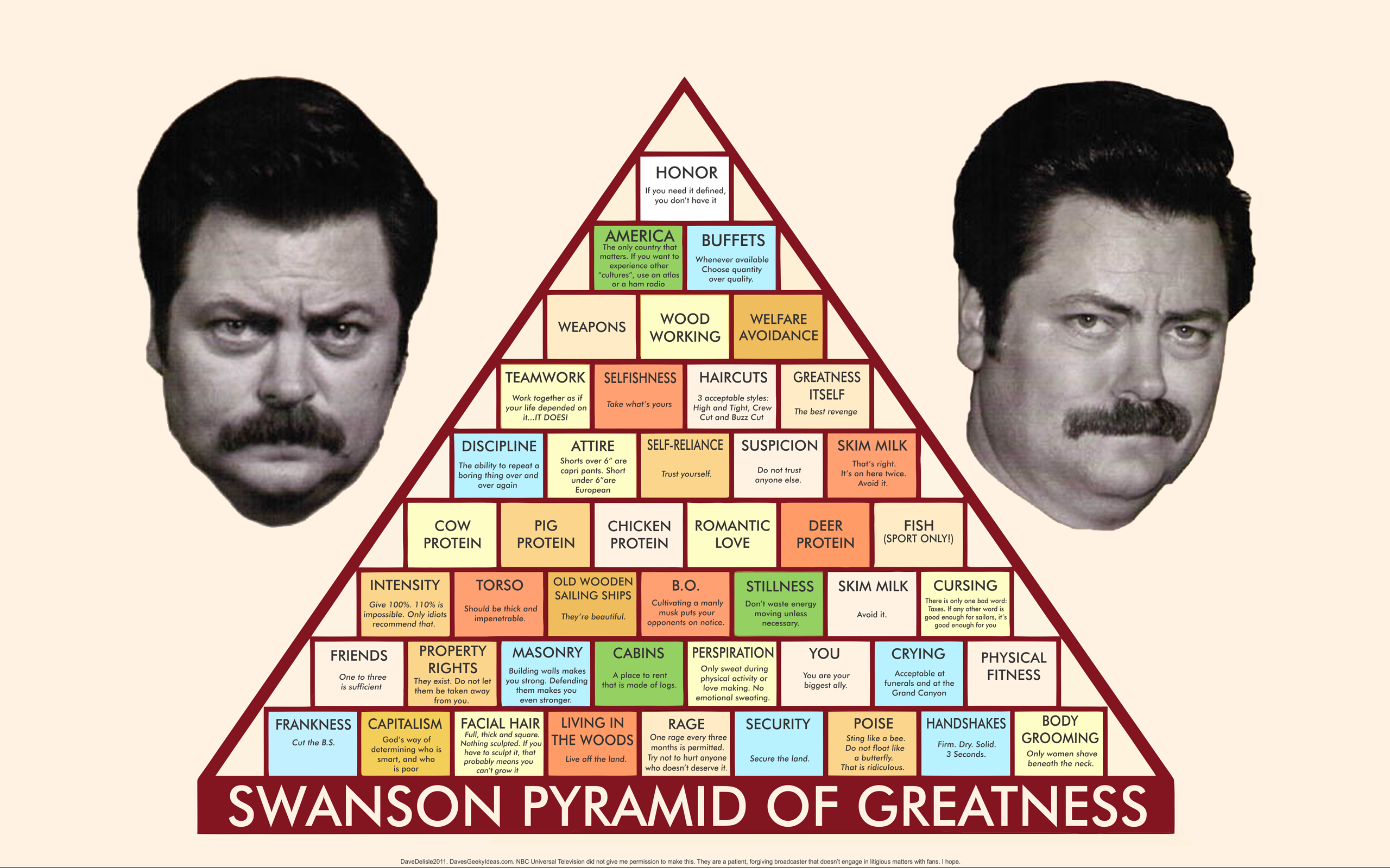
Ron Swanson Pyramid Of Greatness Wallpapers Part 2
So this is a wallpaper made possible by the internet! I took the original image (the largest I could find - 1080 x 813), and then I uploaded it to this amazing site that vectorizes image art, Vector Magic. They traced the pyramid for me and generated a vector file, though I had to paint over the text prior to uploading, because it couldn’t trace the text very well at all.
I then typed everything out with a placeholder Arial text. I was very amused by every line I typed! But I did not know what font was originally used. I then discovered this other great website called MyFonts that scanned the image and deduced the font - Futura MD. I feel sheepish because I used Futura for all my IKEA designs. Ah well.
It was then a matter of pasting the horribly cropped images of Nick Offerman’s mug, and then resizing it.
16:9 Widescreen wallpapers - including a MASSIVE 2560 x 1600 - are marked normally. 4:3 Fullscreen wallpapers are marked with an ‘FS’ designation. In there is a lone iPhone wallpaper.
Hover over to see the image size, click to enlarge.


That’s a whole lotta Ron Swanson. NBC Universal (er…Comcast?) didn’t commission or give me consent to make these. But I think they look a million times better than the ‘official’ 1000×813 image that is floating around the interweb. If NBC and Parks and Recreation would like these for their own sites, they are more than welcome to take these.
2 comments January 28, 2011
There Has To Be A Better Way For NHL Players To Hang ‘Em Up
This week, longtime NHLer and fan-favorite Craig Conroy of the Calgary Flames was placed on waivers (where another team could claim him), but no one grabbed him and he cleared waivers, meaning he’ll be assigned to the farm club in Abbotsford. All signs indicate he’ll just retire instead.
In the Salary Cap era, this exercise of placing a player on waivers is a common one, to either free up salary room or a roster spot. Conroy was waived for his roster spot, though many other players are currently buried in the minors because of their large salaries.
Was it a classy move by the Flames? Not in the least, but well within their right to do. That’s the reality of the Salary Cap.
The Flames are a world-class team, and will pull out all the stops for Conroy. He’ll get a nice press conference to announce his retirement. Perhaps a pre-game ceremony where he could salute the fans. Conroy will more than likely land a role in the team’s head office.
But Conroy was robbed of getting to play his last game, where the fans could cheer him all night and send him off with a standing ovation. The fans were also deprived of saluting Conroy in their own way.
It was only a few years ago when Trevor Linden of the Vancouver Canucks was given a rousing ovation by the fans during his last home game. Even the opposing team (my Flames) all lined up to shake his hand. It was a moment that made you proud to be a hockey fan.
There has to be some rules that would allow veterans to retire on their own terms. Here are some ideas:
1. A 10-year+ veteran would be given a one week notice (a home game would need to be scheduled at the end of said week) that he’ll be placed on waivers. He can opt to retire or take his chances being claimed or risk being sent down. A retirement agreement would allow him to dress for that home game, then call it quits.
2. Veterans could withdraw themselves from the waiver wire, and be given the option to play one more home game (see a trend?).
3. Players who don’t report to the farm team usually get suspended. Perhaps you could suspend the player until the last home game of the season? Hint hint.
4. A retirement clause could be written into the contract. This would be like a no-movement clause. This would only be for fan-favorites, like Conroy, and those who have played many years in the league. They deserve a nice sendoff.
5. Performance-based incentives that would keep a player from the waiver axe. Instead of being blind-sided by getting waived, a player would know if they are in jeopardy if they are not meeting production expectations. If they are contributing, they shouldn’t worry.
Add comment January 27, 2011


