Karate Kid Tournament Poster
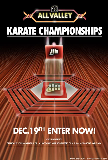
A replica of the poster seen in the Karate Kid, hanging in the Kobra Kai dojo. It’s a good thing it was on the wall, otherwise the plot would have been completely different.
Every time they announce injuries in the NHL as “upper/lower body injury”, I think it’s because of this tournament. You don’t want coaches prompting their players to attack injured opponents (“Sweep the leg!”). Though I have a feeling it happens.
This is from the original 1984 film, not that remake from last year, in case you kids are confused. Darn kids.
Here is a massive 2k x 3k version, if you’d like to print it out and throw it on your wall (or use as a wallpaper), click to enlarge:

FYI I cannot paint to save my life (check out this hatchet job I did for that Good Will Hunting painting), so I cheated and used 3D. Fortunately my painting ability is somewhat on par with the air-brush work used in the actual poster.
I then built the All Valley logo with vector art. All the fonts used were some variation of Futura - a very versatile font I am finding.
This poster was made because it doesn’t exist online, which is sort of shocking. There are Kobra Kai and All Valley logos in spades, but no trace of this poster. Plus I wanted to print one for my wall. Looks sharp, if I may say so.
Winnipeg Jets Logo Officially Revealed. And The Verdict Is…
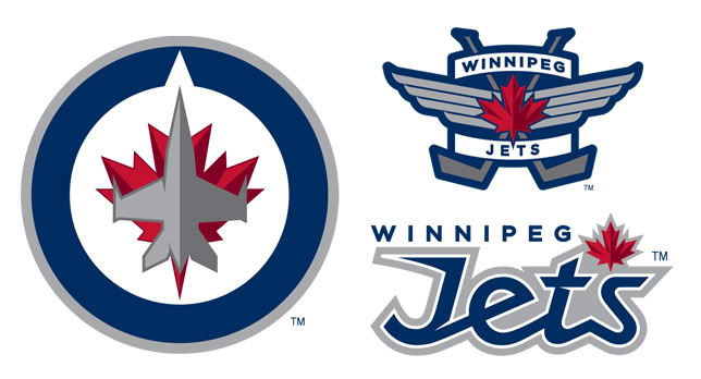
True North Sports and Entertainment finally revealed the logos and colors for the Winnipeg Jets 2.0, and while they aren’t disastrous, there is a lot of room for improvement.
Incorporating the RCAF into the overall design scheme was a great idea. The team is called the Jets, so why not go the patriotic route? Air Force imagery lends itself well to sports logos.
Here are my critiques for each logo:
1. The Main Logo: The jet overlaying a maple leaf in a circle arrangement is homage to this RCAF logo. That arrow at the top is pointing north - for the team’s location and a reference to the ownership group. If you can get past the striking resemblance to a certain other Maple Leaf team, this logo works - somewhat. It doesn’t work as a small thumbnail, because the jet and leaf become a jumbled mess. For black and white publication, the logo will be indistinguishable as well. EDIT: Looks like True North thought of that as well, and have black and white variations of the logo too. These features an outline around the jet to help it stand out. No greys would be used.
2. The Secondary Logo: My favorite of the three. It’s generic and similar to a million other logos out there, but it would look great as shoulder patches on the jersey. It’s a classic. I would’ve made the outline for the maple leaf white, to help it stand out a bit.
3. Wordmark Logo: This one I don’t really care for at all. The maple leaf looks like an apostrophe, the hybrid of script and sharp edges for the Jets word is weird. I’d lose the maple leaf (no shortage of leafs here anyways). This logo needs to be more compressed to look decent on a helmet (where wordmark logos are typically situated). One thing I noticed is the top half of the ‘s’ is a dead ringer for the same letter in the Jets 90′s logo - so a bit of a homage there.
I like the colors, though True North may regret using six of them down the road (2 reds, 2 greys, white, and navy blue) in terms of costs. When you print a T-shirt it costs more for each color (as an example). EDIT: Apparently they are using shiny silver as they grey colors, you can see it in their embroidered goods (like hats). This helps the logo tremendously as far as the jerseys go. For print media, shiny silver doesn’t translate at all.
Going back to my earlier post about the captaincy patch, maybe it would look cool if they made it look like a captain’s rank insignia from an officer’s uniform?
Overall not bad, but not great either. Can’t wait to see the jerseys.
Here is my take on the wordmark:
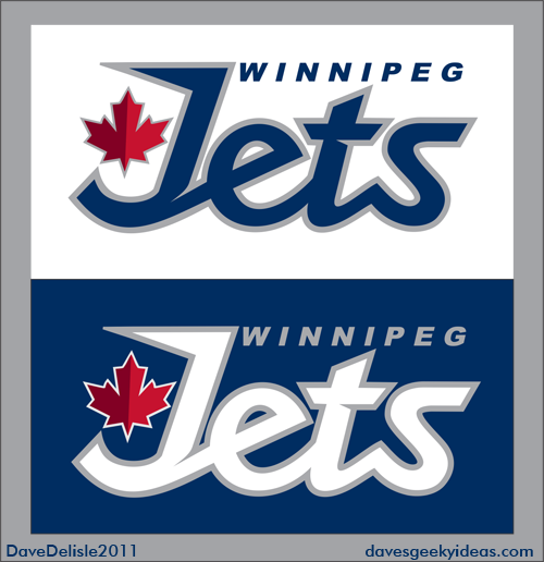
And here is my AWARD-WINNING* Winnipeg Jets design, with the new colors infused:
![]()
*All of my stuff is award-winning, in that I award myself a cookie after each post. ![]()
Trading Card Idea
You know those 3D jigsaw puzzles for landmarks like the Eiffel Tower and the London Bridge? I’d like to include those puzzle pieces in foil card packs that would allow fans to build structures specific to that trading card line. Hockey cards = hockey arena. Pokemon cards = Pokemon Training Center. Magic: The Gathering = a castle?
Except that it wouldn’t be like a puzzle featuring many unique parts which requires guesswork. There would be a dozen or so distinct piece types that are interchangeable (like Lego). So for hockey, you’d get pieces for the ice, boards, glass (clear plastic pieces), seating, and the scoreboard. You’d then assemble according to a diagram. For personalization, stickers would be provided on other cards.
The beauty of this is that all the pieces are flat, and can easily fit into foil packs. This would have that papercraft feel, but all the cutting is done for you. The building would also be a great display for your cards.
Winnipeg Jets Captaincy Patch Idea
So as all the hoopla over the new Winnipeg Jets logo, colors, and jerseys soon draws to a close (one would hope!), I thought I’d offer up this suggestion: for the captaincy patch, include a golden jet.
I’m sure a lot of you hockey fans get the reference I am making here. For the rest you, the golden jet is a reference to Bobby Hull, an NHL and WHA legend who went by the nickname “The Golden Jet” because of his blazing speed. He played for the WHA Winnipeg Jets from 1972-1980.
Because of Hull’s nickname and longtime affiliation with the Jets, I think it would be a cool tribute to make a captaincy patch like this. The captain’s patch is already a badge of honor as-is, but this little gesture says you’re following in the footsteps of a legend.
The Calgary Flames already do something similar with their captaincy patches, with the captain’s ‘C’ being the Calgary Flames logo, the alternate captain’s ‘A’ being the Atlanta Flames logo, a nod to their past.
It would be nice to pay homage to Atlanta in some form here as well (or cruel, if you’re a Thrashers fan), but there is nothing in their logo set that would be at home on a Jets jersey.
If you like this, check out my design for the Winnipeg Jets mascot, a Jets logo, and a few ideas to fit more seats at MTS Centre.
Earbud Ideas
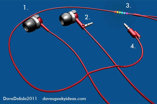
1. Built-in speakers. You can take off your earbuds and switch these speakers on. Handy for times when you want tunes, but cannot wear earbuds (like talking with your buds).
2. A built-in jack. This way you can plug your MP3 player directly into an AUX port, without having to switch to another cord entirely. This would flip out of one of the earbuds like a switchblade.
3. Visualizer. Okay this one is entirely cosmetic, but I always liked the idea of a visualizer on the earbuds or the MP3 player itself. Sure it’s a bit Lady Gaga, but it looks cool.
4. A spare jack port for sharing the audio feed. Sure it seldom ever happens, but this would be nice feature that would allow a friend to listen in. Handy for when you want to a share a film on a long flight. You could buy one of those splitters, but they are never around when you need one.
Ah, the internet.
An older earbud idea that features ejecting earbuds can be found here.
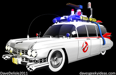
Here is a link for my Ghosbuster earbuds. I really need to re-do those.
Nintendo Wii U Makeover
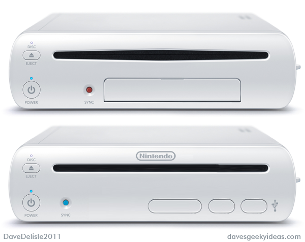
Nintendo's Wii U as-designed (top), my makeover (bottom).
To me the appearance of a game console is something of an art - well, a lost art. Console design has been languishing these past several years, as every console maker opts to release piano black or ivory white slabs that exclaim ‘adult contemporary’. Gone are the colorful palettes and unique designs that game consoles were once known for.
And the latest Wii U is no different. Enlisting some Cupertino-inspired design cues made for huge design strides over it’s Wii predecessor. However it’s still a bit flawed and generic in my opinion. So I made some changes:
1. This is the most important addition - the Nintendo logo. I’ve never seen a company forsake it’s logo like this. The Nintendo brand is a worldwide brand juggernaut, so it needs to be seen on the flagship product front-and-center. It’s probably stamped on the case elsewhere, but it needs to be on the fascia.
2. The disc slot is streamlined, because right now it looks like a weird mouth. My slot design is more conforming to the overall shape of the console, and doesn’t have that “pried open” or floppy disc slot vibe. Ask your parents what a floppy disc was.
3. Moved the Sync button closer to the left and changed its color. The current location is a bit too centered for my taste, drawing more attention than it should. Also I ditched the red as it just looks like a pimple on this smooth face. The blue is similar to the power indicator light, and compliments the grey and white scheme nicely.
4. Removed that large flap from the front, and opted for an Xbox 360-like panels that push inward for the USB and save card ports. If there was one thing I dislike about the Wii U design, it’s that unsightly flap. If it were up to me I’d move all these ports to the side (like the GameCube ports on the Wii), but for the sake of not re-inventing the wheel too much here, these push-panels will do. Instead of having one flap down to reveal 3 ports, these individual slots will not detract from the console’s appearance, especially if you’re only using one slot at any given a time.
I will be posting more Wii U Makeovers this next year until the console finally releases sometime in late 2012.
If IKEA Made Geeky Furniture Part 15: Skyscraper Comic Book Display Case
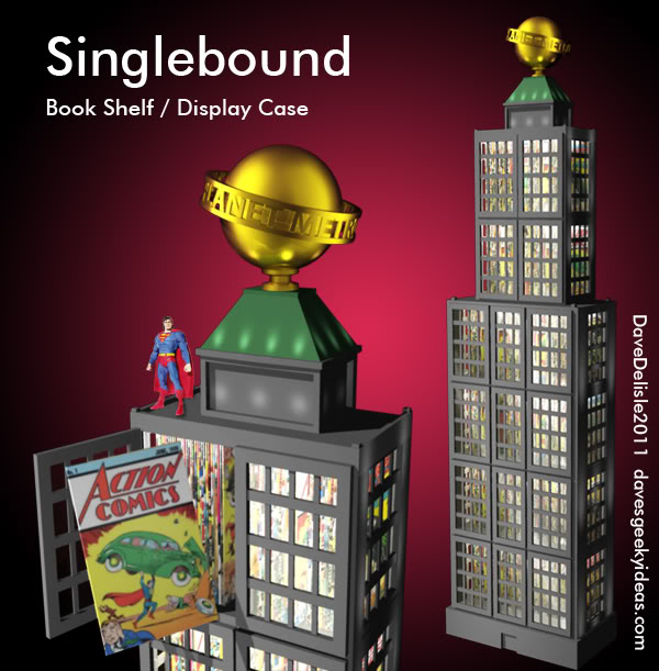
I recently used a Comic Book rack for Blu-Ray movies earlier in the IKEA series, so where does that leave actual comic books? Perhaps a bookshelf/display case shaped like the Daily Planet will fit the bill.
Of course it could be another comic book building such as the Daily Bugle or the Baxter Building, but for the purposes of this idea the Daily Planet is the most iconic. Certainly doesn’t hurt being affiliated with Superman either.
This design is based on those fancy china cabinets, which are typically fitted with glass doors and interior lighting. I thought I’d add some exterior flood lights too, much like a skyscraper would have.
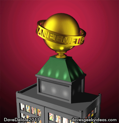
Besides the lights and the spinning globe, the ledges on the building would be ideal to display your action figures (as seen above). A few other odds and ends could be added, like flag poles, gargoyles, blinking red lights (markers for air traffic), and so forth.
I think the lighting and glass - while crucial in making this appear just like a building - adds luxury and class to the overall look. It’s a great way to display your comics.
This particular design is only about 7 feet tall, so there is room for growth. A few imperatives: a switch to turn off both the lights and Daily Planet globe, and the glass has to be specially-coated to preserve the books from damaging UV light.
I’d love to have one of these for my books, games, films, and other assorted geeky wares.
12 Exclusives For SDCC 2012 I Want To See
San Diego Comic-Con is an annual geek mecca that showcases films, TV shows, video games, toys, and comics (believe it or not!). As if the attendees weren’t already spoiled enough, toy companies will offer exclusive wares only available at SDCC. Some of these exclusives are available online for purchase after the event, usually in limited quantities. Either way, you’re only getting these coveted exclusives by either attending or paying a ransom on eBay. Here is a sampling of this year’s awesome selection.
I already have a ton of ideas posted that would be suitable for SDCC, but this list is mostly all-new ideas. So without further ado, 12 exclusives I’d like to see at next year’s SDCC:
Ecto-1 Collectible. I’ve already mentioned this, but Diamond Select has released 3 flavors of the BTTF Delorean, all of them awesome. I’d like to see a comparable Ecto-1, complete with lights and sounds as well. One feature: the lights and siren can be toggled on/off.
Back to the Future electric train. Remember that time-traveling train seen at the end of BTTF III? I’d like to see this made into a working electric train that can be used with model train sets. Sure it would look great to display, but a collectible like this may help rejuvenate enthusiasm for model trains, as this hobby is apparently more popular with the older crowd.
Pinky and the Brain figures with cage playset. You know how the 80′s are all the rage these days? Won’t be long before the 90′s make a big resurgence. And who better to lead that charge than Pinky and the Brain! This would be the pair of figures complete with their cage, and maybe a few props like a running wheel and a chalk board.
MEGAS XLR / Iron Giant action figure. Either of these giant robots would make for an awesome figure. MEGAS has yet to receive the action figure treatment, while the Iron Giant saw a few released during it’s theatrical run (and are hard to find).
G.I. JOE The Movie 25th Anniversary set. While I am a bit annoyed Hasbro and Paramount decided not do anything to celebrate the 25th anniversary of Transformers The Movie this year (I’m guessing Dark of the Moon was their priority), next year could be a big party for JOE. I recommend a commemorative action figure set, featuring the movie’s core cast. A Blu-Ray copy of the film wouldn’t hurt either.
Princess Bride Collectible. 2012 also marks the 25th anniversary of this classic, a favorite amongst geeks. While my Blu-Ray idea would be cool, I think a few figures/statuettes from this film would be highly sought out. I think Dread Pirate Wesley and red-gowned Buttercup would do the trick. Though a Iñigo Montoya figure would be a fan-favorite too.
Robocop and ED-209 set. Sorry I’m repeating myself here, but it’s RoboCop’s 25th anniversary in 2012 as well. A set featuring the two iconic robots would be awesome. Would like it die-cast as well. A Blu-Ray film to complete the package would be sweet.
Predator 25th Anniversary figure. Last 25th I promise (starting to feel old). Obviously this guy has been done to death merchandise-wise. However if I designed a figure it would include a working laser sight, a working ‘self-destruct’ wrist device (working lights, not an actual explosion), and removable mask with moving pincers. Something the late great Stan Winston would be proud of. Maybe include Arnold’s ‘Dutch’ as a figure too.
Star Wars 3D Helmets. It wouldn’t be an SDCC without a Star Wars exclusive. By this time next year, the Phantom Menace will have finished it’s run in theaters (complete with it’s new 3D coat of paint). One would assume they’ll release the film on Blu-Ray around the summer or fall. So why not a helmet with built-in 3D glasses? I’m thinking Boba Fett, a Stormtrooper, or Darth Vader himself. This was something Transformers tried this year, but not done with a full helmet. Perhaps a bit too geeky, but Star Wars has covered every conceivable figure possible, and I didn’t want to retread old territory here.
The Last Starfighter GunStar. This spaceship would be a cool keepsake. Ideally in Star Wars scale, with Alex and Grig figures included. I’d also take a StarCar as a consolation prize, but only if it came with Centauri.
Transformers Crossover Figures. Hasbro’s Transformers are another SDCC staple. I’ve mentioned this before, but I’d like to see Transformers mix it up with famous automobiles, like the General Lee, Batmobile, Ecto-1, and so on. A few other possibilities: A Samus Aran that can transform into her Morph Ball, a Spaceball ship that can transform into Mega Maid, or an Inspector Gadget car that can change between police cruiser and minivan.
30th Anniversary Wrath of Khan Ceti Eel collectible. Yup, Star Trek II turns 30 next year. How about these earrings? Perhaps a Ceti Eel set (the basis for those earrings), which has an eel figure in a glass cylinder case, complete with sand! Now you too can own this lovely pet. This could even be a cool Blu-Ray case. This creature is probably too icky for most people.
We’ll see what happens in 2012. And to all those attending SDCC this year: :p
EUReKA Review Season 4 Episode 12: “Reprise”
I can only sum up tonight’s episode as a crazy and chaotic journey that you couldn’t appreciate until you got to the destination. And once you have arrived you can forgive a lot of what’s happened, if you don’t get hung up on the event that started all the craziness. Read the rest of this entry
Fictitious Food Ideas
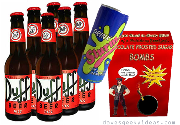
With news that South Park’s Cheezy Poofs will actually become a product available for Walmart shoppers next year, I thought I’d offer up some ideas for other fictitious food products.
In no particular order:
Duff Beer. This Simpsons’ staple is actually available in a few countries (Mexico, Germany), but Matt Groening refuses to license out the brand, in fear that it will incite kids to drink. How about Duff Root Beer? I think the Jones Soda Company would be all over that. The same could be done for Pawtucket Pat’s beer featured in Family Guy. Alamo Beer from King of the Hill too. Fox loves to shill beer, it seems.
Slurm. Futurama had a knife out for soda manufacturers with this spoof product featured in a classic episode, and the Slurm soda brand continues to be a recurring sight gag on the show. I’d like to think Mountain Dew could do a limited run of their soda adorned with Slurm branding.
Chocolate Frosted Sugar Bombs. The cereal of choice for Calvin and Hobbes, well, Calvin anyway. The ridiculousness of actual children’s cereal brands was an easy target for the comic strip. In fact you could say Calvin’s hyper behavior could be attributed to this very cereal. While I would not recommend the manufacture of this actual cereal as described (there is also a variant with marshmallows even), some sort of souvenir box would be great. This item will never happen - Bill Watterson’s stance against products based on Calvin and Hobbes is the stuff of legend. I still want a plush Hobbes tiger…for my niece. Heh-heh.
Powdered Toast. Alright this one would be impossible to do (powder that forms slices of toasted bread), but a gift canister featuring Powdered Toast Man (and maybe Ren and Stimpy too) would be a funny item to display.
Soylent Green. I think this should be offered in milkshake form - like those Shamrock shakes McDonald’s use to sell for St. Patrick’s day a long time ago. Mmmm Shamrock shakes. This could even double as that green milk from Star Wars. UPDATE: You can now buy Soylent Green crackers.
Battlestar Galactica Ambrosia. BSG has taught me many things, like the essential need for alcohol to help cope with difficult times. Certainly helped me get through Season 4 of the show, Ha. This liqueur of Admiral Adama and Saul Tigh would look great in your study.
Sweetums Snack Bars. This food company is a regular staple in Parks and Recreation. A bit obscure to be on this list, but I want these. Speaking of Parks, maybe some TV dinners based on Ron Swanson? Gotta be manly dinners.
A few real ones:
Stay Puft Marshmallows. I bought these from Thinkgeek. The caffeinated ‘mallows aren’t bad. The box they came in is a nice keepsake.
Popeye Spinach. That’s actually a thing (or it was). And a smart product tie-in, but for the love of me, who wants to buy canned spinach?