Jurassic Park Wallpaper: Fences Are Failing

Fullscreen 4:3 Wallpaper 1920 x 1440 Click To Enlarge
UPDATE: You can now buy a high-res poster of this image here.
It’s been a while since I’ve done a Jurassic Park post, and even longer since I released a geeky wallpaper (not counting train maps), so this fits the bill nicely. This wallpaper recreates the desktop seen in the first film.
Request: If there are any video-savvy folks out there, I was hoping for some help in recreating the animation from the film for a looping YouTube video. I can provide this backdrop, and several overlays (for the alarms). You’d need to scoop the audio and compile the image sequence, and create a lengthy loop (something like this, but not necessarily 10 hours!). Email me if you are interested. I was just going to do a GIF but the alarm beep audio is crucial. UPDATE: Someone has volunteered! Hope to have a looping video for you all to enjoy soon. Also I was pointed to this video as well, check it out.
Above is the fullscreen 4:3 ratio, below is the widescreen 16:9 ratio.

Widescreen 16: 9 Wallpaper 1680 x 1050 Click To Enlarge
I have to admire the design of this desktop and its usage in the film. So much information is present, which helped signify a lot was going wrong. You don’t get bogged-down in information overload at all. Genius.
For more Jurassic Park posts, click here.
Share this:

Second Dark Knight Trilogy Blu-Ray Case
This is the second Blu-Ray case design I’ve done for the Dark Knight trilogy, the first one (posted way back in early 2011) was based on the Tumbler Batmobile. After seeing the costume display case in the Dark Knight Rises, I thought I’d attempt another one.
I tinted the glass blue here so you can see it better. It has two compartments: one for the batsuit figurine, another for a large blu-ray case (big enough for 3+ discs). This box set would fit in nicely with a library of movies on the shelf. And yes, the suit does look weird without a cape but that’s how it appeared in the film.
Share this:

Back To The Future iPhone Speaker Dock
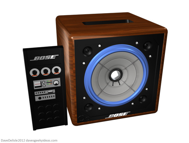
Surprisingly this is the first iPhone dock I have ever designed here (I only designed iPhone chargers previously). Better late than never! And what better than the amplifier that got 20 seconds of screentime in the first Back To The Future film. Read the rest of this entry
Share this:

Punch-Out!! Postcard
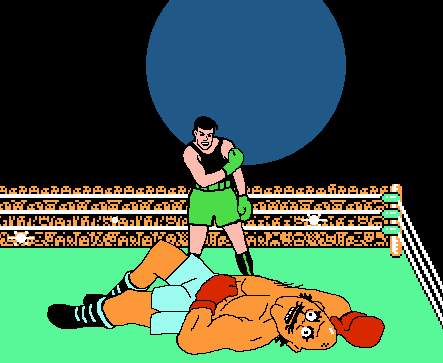
This homage of a famous Muhammad Ali photo (done in the style of the NES Punch-Out!! game) was originally intended to be a poster project. However plans to make it available as a poster have been shelved out of fear of legal reprisal — famous photographs are notoriously litigated these days for copyright infringement.
I always thought it would be fun to make sports memorabilia with a video game twist. I intend to do something along those lines one day. I believe there are a lot of other geeks who enjoy sports, much like myself.
Instead of a poster, I’ll offer it as a freebie postcard or photo you can print. They’re available after the jump. Read the rest of this entry
Share this:

Geeky TVs Part 3: Star Wars

In my first Geeky TV post I more or less stated all TVs look the same. Well that’s not necessarily true - I am partial to those with an outer glass frame. And that unique design element is something I incorporated into this Star Wars themed TV.
The internal LED glass frame (similar to this) is skewered to look like a projection from the ever-popular R2D2. The display frame is given a light blue color to help blend in. The stand is black to make it look the “projection” is floating in space (very effective in a dark room).
Share this:

Drive Meets Hot Wheels Mashup T-Shirt
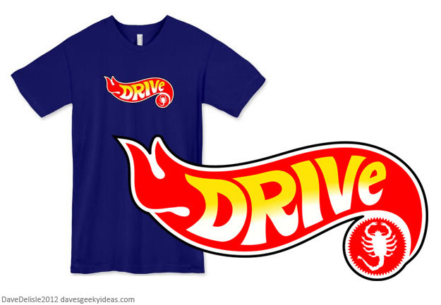
UPDATE: this tee is no longer available, the merchant that sold them is now closed.
I do offer shirts here at davesgeekyideas. It’s not something I like to broadcast for two reasons: I like the “hidden gem” approach with these shirts, and also they are incredibly expensive. $27 for a custom T-Shirt?! Sorry for that. I wish they used Gildan instead of American Apparel. Ah well.
Share this:

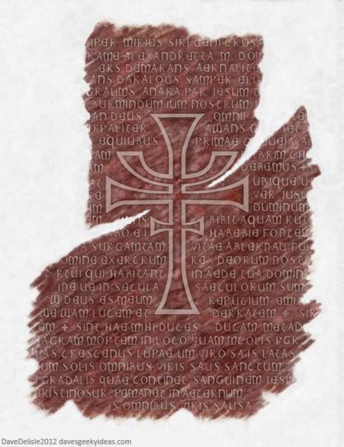
Indiana Jones’ Last Crusade Rubbing Poster
Click here to grab a poster.
The latest addition to my geeky poster store continues the trend of art seen in films and television. This one is a facsimile of the composite charcoal rubbing created by Indiana Jones in the Last Crusade film (remember when that film capped a trilogy perfectly?).
This one is about 90% accurate. Some characters at the top left needed guesswork. You’ll have to fold it, crumple it up, and add some tears at the edge to make it look completely authentic.
When I illustrated the letters I saw some actual wording used in the film - it’s not just a bunch of random text. References to a crescent moon, life eternal, and Alexandretta all present and accounted for. Several other words could be loosely interpreted as well.

