IKEA RIBBA Papercraft Part 1: Super Mario Bros. 3
UPDATE: Here is a simple template, just cut and fold into a box shape, then affix to back of Ribba frame:
Click To Enlarge
Original post as follows:
A few weeks ago I posted this idea about using picture box frames to display video game dioramas - specifically screenshots. I even described what a Mario one would entail. Shortly after I decided to make that idea a reality.
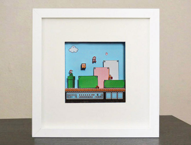
Making this possible is the RIBBA, a picture box frame from IKEA. These are approx 9.5 x 9.5″, with a mat frame of 4.75 x 4.75″. The box is about 1.25″ deep, and is a popular item for displaying LEGO minifigs and other physical objects. These are only $10.
I could have discarded the mat and used the entire box to display this screenshot, which was my original intention. But then it became difficult, as the 9 x 9″ interior wasn’t friendly to my printer, with a max 8.5″ width setting. I also had concerns about wasting too much paper again, and the weight of objects sitting in the box.
Then I read the mat could sit at the back or the front of the frame (against the glass), thanks to an internal divider. I then decided to make a small 4.5 x 4.5″ screenshot, with a depth of only .5 inches. I could have went even further back, but I wanted the question mark block to be close to the viewer.
I am pleased to report this went quickly after I printed it out. The whole sky box is taped against the mat, which is great if I want to reuse the mat again. Much of it is taped, save for the characters being glued in.
Going forward, I’d like to do a version 2.0 of this design with an LED question mark block. There is plenty of room in the frame to store electrical guts and batteries. Might even illuminate the score board too, making it look like this old alarm clock design I made.
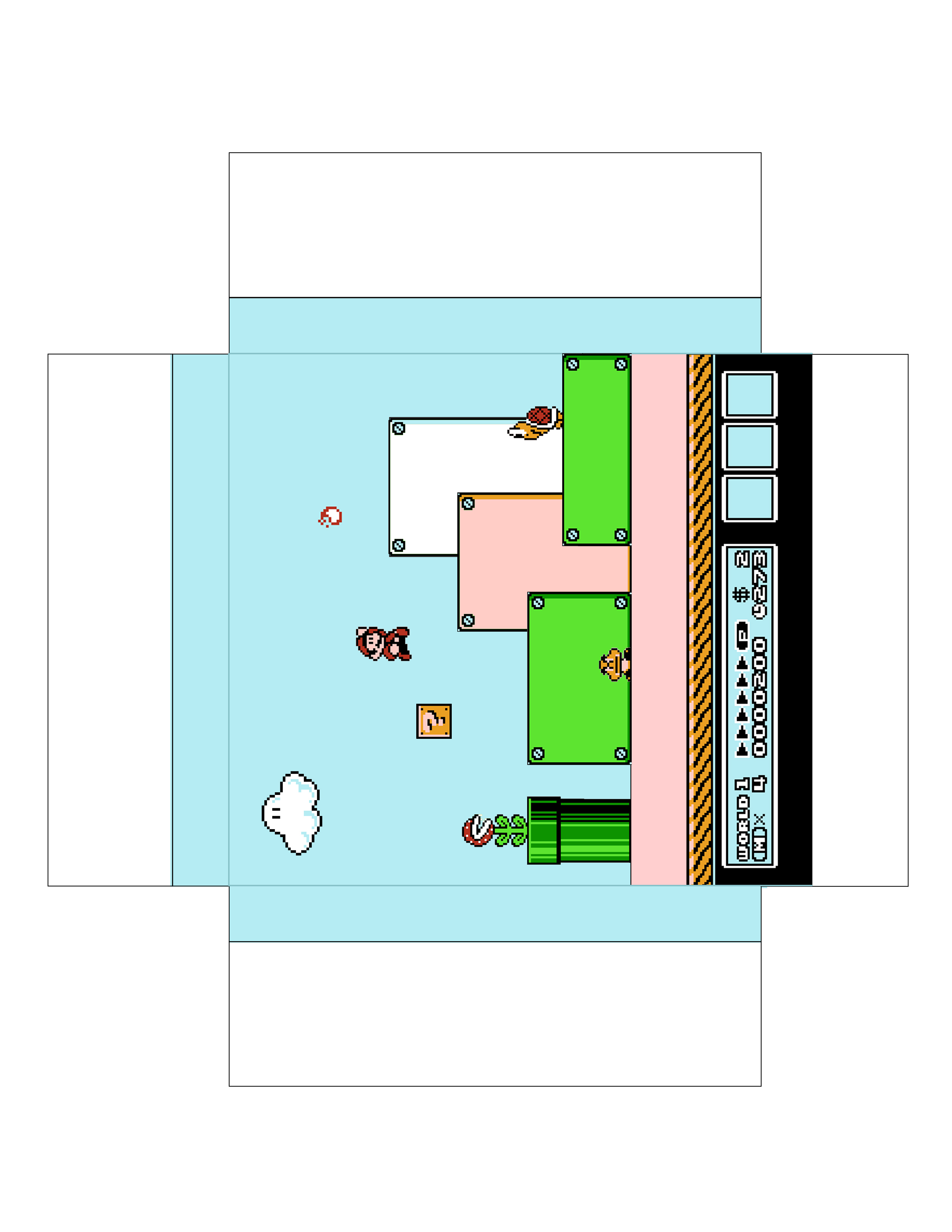
Here is the template. You’ll need a RIBBA frame (you can order them online, see above for the link). Do not re-size the images, print as-is to fit the frame. If there is a warning about cropping, ignore it. Everything you need is well within the safe printed area. Use Card Paper, not regular paper which is flimsy and won’t hold up.

Click To Enlarge

Click To Enlarge
I recommend you punch out all the yellow boxes on the background image first (a lot of tabs are to be inserted here), then cut out and fold. Tape to the back of the mat frame. The tape is so handy for this part, as you can reset and line-up to the frame easily. You just need scotch tape.
Then install the question mark block, the white block, the green/pink/green block combo, and lastly the the pipe — in that order (with tape). The pipe and white block have supports to keep them upright and away from the backdrop.
Lastly add all the characters with glue. It is impossible to cut these pixel-perfect, this being so small. Do the best you can! Lastly throw into frame and hang on the wall or sit on the desk. Enjoy.
It turned out really great being a smaller screenshot. Has the same kind of detail as a ship-in-a-bottle. Okay a slight exaggeration. It looks pretty darn cool on the wall. Very 3D, of course.
I removed the black drop shadow from the game graphics, as all the actual shadows look really nice. I managed to find this section in the first level of Super Mario 3, and it was perfect! The area was populated with 3 different enemies, a question block, a pipe, and a cloud. Vintage Mario.
I know it’s asking a lot to require an IKEA frame for this project, but if this is popular enough I will continue to output Papercraft models for the RIBBA. I already have Street Fighter II in mind.
UPDATE: I did a second version, which assembles much like the Question block from the first one. I also added clouds that are floating in space. This one is more advanced.

Click To Enlarge

Click To Enlarge
Share this:

LEGO Package Design
NOTE: This was my entry for the 2011 SCA Package Design contest. I did not win, and it haunts me to this very day.
SCA had a LEGO packaging design contest which was open until yesterday. The goal was to create a replacement design for the case that held starter LEGO and Duplo sets. This design would address numerous factors, ranging from production to retail to consumer use.
Knowing that everyone else would make a case that resembled a LEGO brick, I decided to do something different.
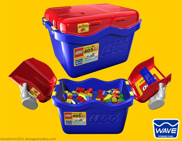
Today I unveil most* of my entry, which I call the Wave Case. The wave shape is not for looks, but for function. For starters the wave shape creates four distinct handles, making it easy to carry:
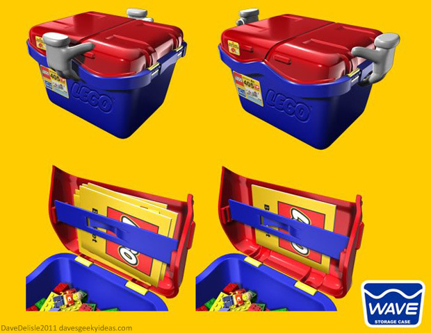
One of the Wave Case’s features is a storage bracket for all the booklets and pamphlets that come with LEGO sets. This bracket is adjustable, allowing for more booklets to be added. This promotes the collection of LEGO, and helps prevent the waste of printed materials.
I wanted to make this case easier to open than LEGO’s current model, where you have to wedge the lid off with your fingers. With the lids attached to the bin, it is a snap to open:
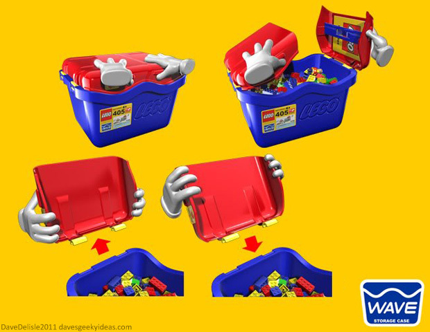
The second reason for the wave-shaped design was to make the removable lids ergonomically easy to pry off and put back on the lid. Note the placement of the hands when pulling off and attaching the lid (above image).
The lids are attached with clasps that resemble the hands of a minifig. Making the lids removable is a safety feature, and allows for the easier spilling of bricks. But one feature I wanted to add that would appeal to many, is making one lid a sort of dustpan/scoop to help in the cleaning of LEGO bricks:
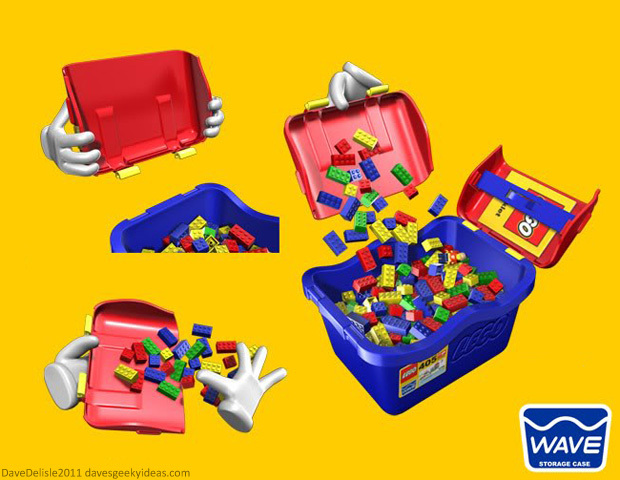
I know some parents would get a kick out of the cleaning feature.
Other features: I made the stickers smaller so they could be more temporary in nature. The current starter sets feature large stickers that cover one side of the case. The bracket system could also store large flat pieces of LEGO, so there wouldn’t be a need for large cardboard placeholders.
*The case is stackable, for both storage and production. I also addressed security straps for retail display. A bunch of other stuff in my entry is not covered here, just wanted to showcase the main features.
Share this:

Ghostbusters Blu-Ray Case
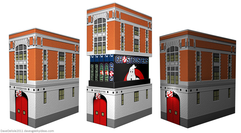
This was an old design that has been redone (original post deleted) in light of a recent tower case design I made. It’s a basic slip cover, but with a small LED sign on the front. This would look good in any library.
As pointed out in the comments a similar case was issued for The Real Ghostbusters that predated my design.
Share this:

Environmental Christmas Solution That Saves Trees And Reduces Wrapping Waste
Lately I’ve noticed this print and ad campaign asking people to try and prevent waste caused by wrapping for holiday presents. I believe the motto is “Give Memories, Not Waste” or something like that. I can’t cite any stats, but we produce so much waste with all the wrapping and ribbons and bows and cards every year. A lot of waste for such temporary use.
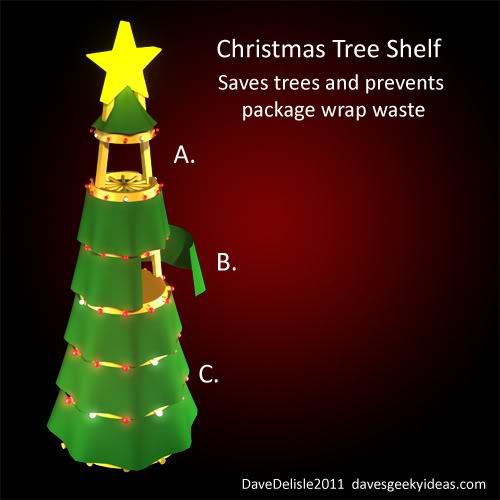
So my solution is to create the means where people don’t have to use wrapping paper. This is a Christmas Tree shelf, which can store numerous presents behind curtains. You could toss the presents unwrapped behind the curtains (B.), or put the presents into burlap sacks and tie the drawstrings to the shelves, which would have wagon-wheel like spindles to tie to (A.).
To avert prying eyes it would be best to conceal presents in burlap, but you could also tie the curtains shut as well. You could also be a Grinch and use a locking system I suppose. I think a bunch of noisy bells could alert parents.
Basically this is merging the tree with stockings. It saves on wrapping and it saves trees. I believe this is much more practical and user-friendly than a pine tree (fake or real), especially when it comes to setup and tear-down.
Other features: This tree could feature built-in lights (C.) and maybe sound effects too. You could easily decorate this tree as well. The tree would revolve on a stand, allowing full 360-degree access to all the loot. This would be quick to set up and tear down, or you could remove all the Christmas-y stuff and have a nice shelf available year-round.
It would be much pricier than an artificial tree, especially with built-in lights and sounds. But think of all the money you’ll save for years, especially on wrapping paper.
One major flaw: this is much more friendly for cats, who love to climb curtains and attack tree ornaments. *sigh!*
Share this:

Geeky Fashion Part 4: Full-Zip Hoodies

Click To Enlarge
Compared to the previous three entries in the Geeky Fashion series, there are plenty of geeky full-zip hoodies (hoodies that zip all the way up to cover the face often forming a mask), but I want to submit these design ideas, which as far as I can tell do not exist yet (feel free to correct me). Some of the more obvious choices, like Spider-Man or Star Wars, have already been done.
Designed these based on what I want to wear, and as usual I kept the designs simple (just like me). The ones I see currently on the market are a bit too busy or skewered towards the kids. The ‘skull’ design looks cool, but it’s not very fashionable for everyday wear.
All of these full-zip hoodies would feature plastic lenses for the eyes to see through. The windy/rainy days I’ve recently encountered made me wish for hoodies like these.
I won’t name them, I figure they are pretty self-explanatory (Commenters feel free to list them). The third one is a general ‘hockey goalie’ design, and could be applied to all NHL teams. The last one, well, I tried to do something with headgear/goggles, but it didn’t look right. Makes for a cool regular hoodie, if I may say so.
UPDATE: Here are a few more.

Click To Enlarge
Share this:

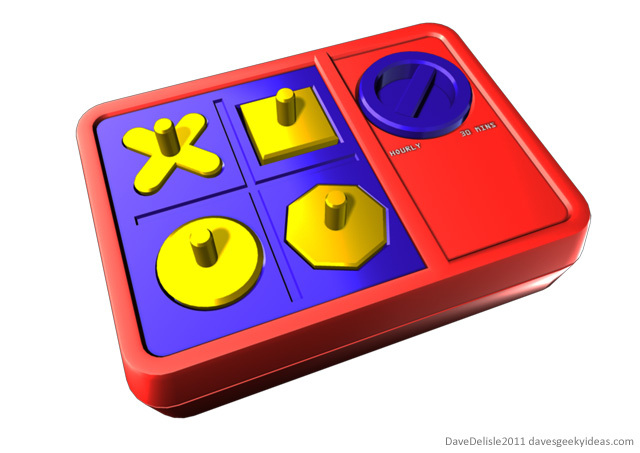
Perfection Board Game Health Reminder
It is recommended that you take a break every hour from working on the computer or playing video games on the couch. Prolonged periods of sitting and doing repetitive motions can lead to RSI or DEATH. Well, probably not death. But you could become fused to the chair. Ew.
The problem is that the duration of sessions on the computer or game console can be difficult to gauge. For many, hours can fly by effortlessly while they are engaged in their work or game. It’s tough to enforce a routine break for yourself.
So I created this egg timer design based on the board game Perfection. You set the intervals for your break at 30 minutes or hourly, and the yellow play pieces will pop up slightly at every interval, reminding you to stand up and take five minutes.
It wouldn’t have the loud winding timer like the board game, the dial is just used to set the break frequency. Just a ‘pop’ and subsequent rattle of play pieces every hour to alert you. Initially I thought it would be fun to have all the pieces thrown from the timer - like the board game - but that is too high maintenance and could become annoying.
This would be a fun-looking yet helpful device for your desktop. I wouldn’t be surprised if your nearby co-workers also used the timer as well.
Share this:

Traffic Light Idea Revisited
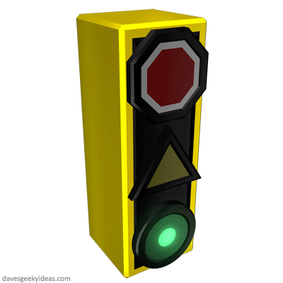
A few months ago I posted this traffic light idea which would grab the attention of all drivers and assist the colorblind. As it turns out, colorblind lights actually exist right here in Canada! The distinct shapes were put to use, and as you can see it looks effective.

I’d still like to use the octagon for the stop shape - such an established icon. But then again the shape may look circular at a distance, which is why I added the white outline. I also made the octagon significantly larger in the previous post - something I should have carried over here (oops).
Thought I’d take the concept a bit further and add animation to the light process. I feel a pulsing green conveys motion, and would perhaps grab the attention of drivers who would otherwise wait for someone behind them to honk to get going.
Also added a white outline blink at the start of the stop sequence, to add emphasis to stopping. It would be as though the light was exclaiming “HEY STOP!”. Originally I wanted the white outline to have a slow blink throughout the red light duration to convey a ‘please wait’ tone, but I figured some drivers would mistake this for the red light ending and jump the gun as a result.
Obviously animations in traffic lights aren’t new, with turning or crosswalk lights blinking. This system would compliment the standard traffic light procedure, which would help increase driver awareness.

