E-Book Ideas
With the proliferation of e-books on tablet readers like the Kindle and Nook, there are potentially new ways to present literature to readers using the digital medium.
Here are a few ideas that e-books could adopt when it comes to presentation:
1. Enforced Serialization. Imagine if the reading audience was forced to consume a book at the same rate as a television show? Chapters would be released or unlocked on a weekly basis. No skipping ahead, no dealing with spoilers from fellow fans. The final chapter would become something of an event.
You would be forced to put the book down, and be left with anticipation for the next chapter.
This would be ideal for new releases. Customers who are late to the serial could play catchup at a daily rate. Once the serial has been released in it’s entirety, readers would have the option to override the drip-feed and read the whole book at their leisure.
Serial novels aren’t a new thing, but their being regulated in digital form would be. The chapters could be unlocked by the e-book reader, or downloaded from the e-book store through a subscription.
You can also pull the rug out from under the reader for serial books, simply by making the words dissipate at a most inconvenient time. How maddening would it be to finally reach a momentous event in the book, only to see the words start to disappear?.
2. Interactive Stories. It would be nice to see the Choose Your Own Adventure books make a return in e-book form. Those books were limited by a set page count, with numerous one-page endings that were not very satisfying and easy to spot, causing the reader to quickly abort and go back (I know I did). In e-book form, these stories would be colossal narratives. Choices for dialogue would also be present (like a Bioware game), to impact conversations in the story.
I’d also like to see books like the Da Vinci Code incorporate puzzles the reader would need to solve in order to advance the story.
3. Customization. Allowing the reader to re-name any of the characters or the setting gives the e-book a more personal touch. A more advanced option would allow the reader to change the gender of the protagonist (Harriet Potter, anyone?). In fairness to the Author, I would permit these options for the second go-round with the book. This way you can enjoy the book as intended, then maybe down the road you could revisit the story in remixed form. Replay-ability for books!
You could also set parental controls here, either for your kids or if you prefer all the gosh-darn swearing to be gone.
4. Reference At The Ready. This would be like incorporating a standby Wiki into the book. I sometimes find when I am reading A Song of Ice and Fire or Lord of the Rings, there will be the odd reference to a person or event that doesn’t ring familiar. I would like to expand on the word or sentence and get the 411. And having the world map a single click away would be handy too.
5. Mood Music. If you are an orchestra junkie like I am, then some background music would be a nice touch. How it would work: you would upload your music into different playlists, each labeled by mood (scary, sad, action, calm, etc.), and the e-book would play a corresponding song depending on what is going on in the story. If there is a change in the mood, the music would quickly fade into another track, or if needed - - complete silence.
6. No Peeking. If you’re one of those people who read the last page of a mystery novel first (shame on you), you should answer a trivia question first before the later parts of the book unlock. Something that proves you made your way through the book.
7. Dialogue With Attitude And Tempo. If you are playing an older video game, you might notice the dialogue unfolds as though someone is typing really fast. When you reach dialogue in the e-book, it should also appear to be typed in real-time, to also give this impression that someone is speaking. Some creative changes in speed would reflect urgency or perhaps broken thought (The character….speaks…..slowly). You may have to prompt this to happen just like a video game, but I think the e-book can get the timing right.
8. Optional Recaps. This is something that is handy with Television shows, at least when returning from the off-season hiatus. An e-book can determine if you have been away for awhile, and can offer to you up to speed with a condensed version of the story so far.
9. Varying Fan Art. Some books like Stephen King’s Dark Tower series feature full-page illustrations to compliment the story. I’d like to see random images or animations culled from a large pool of fan art. Not only would this enhance the book, but the many different art styles would free the reader from viewing the default art (usually done by a single artist) as cannon. In fact, seeing the protagonist illustrated in dozens of different styles would add a mythic quality to that character.
10. Crunch It Down. This is a personal pet peeve of mine: Reading a paragraph that is length of a page! It seems long-winded to me, especially when I can see more interesting bits ahead, like dialogue, one-off sentences, and paragraphs that are only 4-5 sentences long. So I tend to glaze over these gargantuan paragraphs and move on.
I as a reader would like to reduce these to the most relevant information being displayed. After I read this giant paragraph, and suddenly find myself asking what was all that about, I could collapse it into the Reader’s Digest version: Mark had a dog when he was a kid, which his mom wouldn’t let him keep — it’s been eating at him ever since. The author/editor would need to determine what is displayed for the condensed version.
Share this:

How Do These NHL Socks Not Exist?
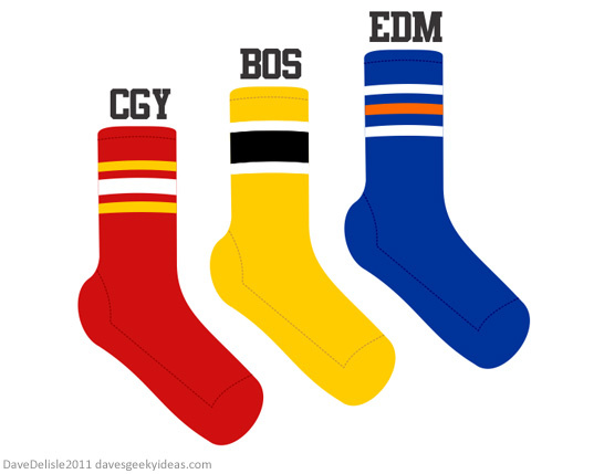
You can buy NHL-branded socks that feature the team colors, logo, and nickname. But what about socks that look just like the ones the players are wearing? No such thing exists!
What is even more baffling, is that you don’t need an NHL license to produce these. That is because these designs are simply an arrangement of colors and stripes - no team nicknames or logos. You’d think some company would capitalize on this.
I personally would love to throw on some red Calgary Flames socks on game day. Being socks they don’t have much visibility, so I can safely wear these when I am out and about here in Vancouver*.
This could also be done with NFL, MLB, NBA and FIFA too. Well, the teams that wear colorful striped socks. Appears to be an endangered species in the NFL, and seldom seen in the NBA or FIFA.
Note: This was going to be a part of the Geeky Fashion series, but this is not quite geeky.
*When I wear my Flames jersey in Vancouver, I usually end up reminding Canucks fans how many Stanley Cups my team has won (just the one - 1989) with a count of fingers. I don’t use my index finger. Ha.
Share this:

Geeky Fashion Part 2: Game Of Thrones Belt
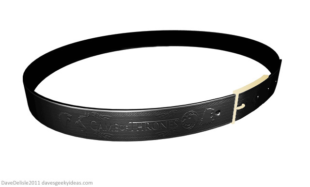
This is a leather belt which features the ‘ring’ pattern design seen in the opening titles of Game Of Thrones. The ring features many sigils, numerous dragons, landscapes, and the name of the show itself. These rings encircle the sun (see video after the jump). Read the rest of this entry
Share this:

Remedial Chaos Theory DIce
If you saw Community’s “Remedial Chaos Theory” episode, then you will probably recognize the design on this dice.
Share this:

Geeky Fashion Part 1: Nintendo Shoes
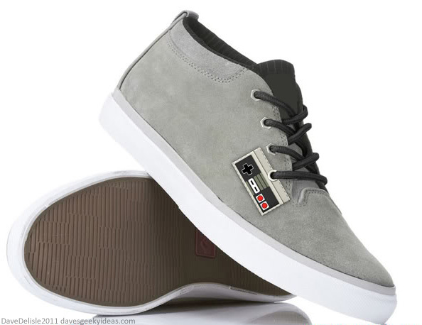
Besides hockey jerseys, I don’t delve too much into geeky fashion here at DGI. Mostly because I have zero fashion sense. Also because any fool can create geeky T-shirts. For this series I will focus on other forms of apparel, like shoes, pants, belts, backpacks, etc. Consider this a followup to the Geek Bling series.
First up we have this very simple NES Controller shoe. The laces double as the controller cord, making it look like a gamepad is strewn about on your foot. I don’t recall seeing any designs that incorporate laces into the theme of a shoe, but it seems so appropriate here. This design can be applied to many other consoles (Sega, Atari - anything with a wired controller).
Simple is a word I’ll be using often for these fashion designs, because I genuinely want people to wear these. Currently you can buy Nintendo-themed shoes which are decked-out in NES and Super Mario imagery, and they look cool for display. Would you actually wear them? Maybe the odd time. I want to design geeky fashion anyone could wear anytime.
BONUS IDEA: Now that I think of it, there is probably a market for small replica game controllers you can affix to your shoe laces. It’s a worthwhile alternative, as it allows you to geek-up any shoes you want.
Share this:

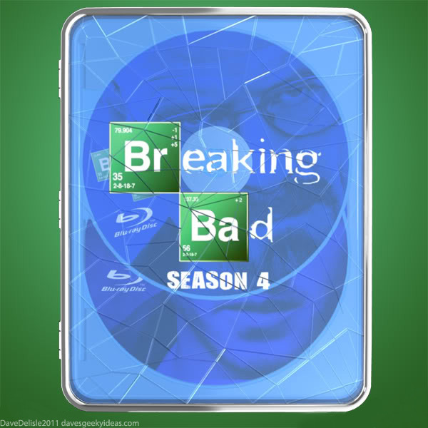
Breaking Bad Blu-Ray Case
Breaking Bad has been my favorite drama these past 4 years. I happened to stumble upon the debut episode during the scene where Walter White takes down the bullies in the clothing store, and I’ve been hooked ever since.
I’ve yet to feature the show in this blog, despite all my brainstorming*. Probably because the show has evolved so much, and is difficult to pin down in terms of iconic imagery.
One thing that has stayed the same is the blue…um, product. Look I’m trying to keep this blog rated G. The last Blu-Ray design was Finding Nemo. Gimme a break! EDIT: The last one was actually Rushmore, which is a Disney production. Really.
This is a standard Tin or Steelbook case design, with the front face removed and replaced with shattered-looking blue plastic. The overall effect is to make this look like a baking tray filled with smashed blue….product.
The shatter theme reflects the name of the show, and is also representative of the depicted violence and destruction - the show’s calling card. It works perfectly for Blu-Ray because of the blue scheme.
I usually do designs for complete series or box sets, however this one is ideal for a single season given the thin design. A box set for these would look like a an upright trolley on wheels that stores 5 of these baking trays, much like you’d see in a bakery (and was used in the show).
I have other ideas for a complete series and may post them soon, but I am leaning towards waiting until the conclusion of Season 5 next year - or more likely in 2013.
*Battlestar Galactica is another show that continues to vex me. Darn you, BSG!
Share this:

Tumbler Batmobile Blueprint
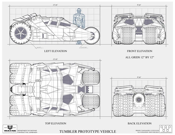
You can buy a poster of this image here (no commission).
I also incorporated the Wayne Enterprises logo into this poster. And as I often do when there is no decent image available online, I will make it myself and share it with the internet. Behold, the Wayne Enterprises logo from the Nolan films:
Click To Enlarge
The ‘Wayne’ text is Arial Black (squashed), and the ‘Enterprises’ text is a font called Euro Caps, which you can get here. Euro Caps needs to be stretched, and the word needed a space between each letter.

