Monopoly Real Estate Sign
I’ve always found real estate signs to be so unsightly and devoid of personality, quite the feat considering they are big bloated business cards for Realtors. You’d think the Realtor was on sale, with their name, picture, and slogan so prominent.*
Anyways, I am seeing these signs just about everywhere within a stone’s throw from my house (I’m scaring away the neighbors with my Farscape references), and I think they could be a bit more fun and a little less heavy on information. So I came up with this Monopoly design, which is quite appropriate if I may say so.
It’s all you need really: “For Sale” and a number. Additional information can be found on the pamphlet (which would look like a Monopoly property card). The familiar Monopoly imagery mixed with the all-too-familiar real estate sign scream hey this house is for sale!
Check out this other sign I designed for Hot Wheels fans.
*Realtors bug me to no end. Once in junior high school we had a Realtor talk to us for an hour. At the end she gave us a packet full of business cards, fridge magnets, pamphlets, etc. It wasn’t a lecture, she was networking! Ugh.
Share this:

Geeky Cameras Part 4: Pokemon
This camera design is for the kids, or the adults still hopelessly addicted to Pokemon. A camera that is in the shape of a Pokeball, so you can capture photos (okay I’m not proud of that one). Read the rest of this entry
Share this:

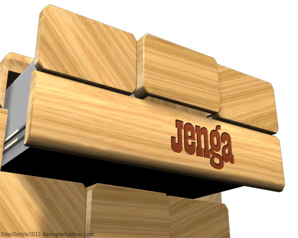
If IKEA Made Geeky Furniture Part 18: Jenga Dresser
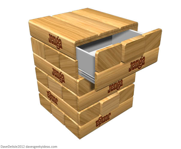
Is it pretty or clever? Not really. This is just a personal victory for me, as the past few years I tried to think of a geeky dresser design to help round out the Geeky IKEA series. And voila! I found one.
This is a bedroom dresser based on the puzzle game Jenga. Apologies if the theme song from the commercial has infiltrated your brain (“You take a block from the bottom and you put it on top!”), this blog can be cruel at times.
You could have several shelves, but I chose this configuration so each shelf can have a proper handle, in the form of an extruded brick:
Viewed from above this dresser would be square-shaped, so it would be jutting out from the wall more than your typical dresser. However it could be made into a smaller bedside table to retain the square shape. This design could even be applied to filing cabinets, printer trolleys, mini fridges, or end tables for the couch.
Please check out the many other Geeky IKEA designs by clicking here.
Share this:

Toronto TTC Subway/RT Map - Super Mario 3 Style
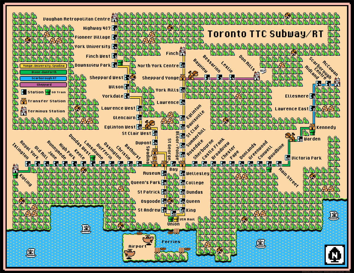
Click To Enlarge
You can buy a high-res poster of this map here.
UPDATE: In light of the TTC finalizing the names for the new extension, I have given the map an overhaul. Apologies to those who have purchased this previously, I thought the original map was future-proof!
If you want to see this image “dance”, please head to my Tumblr (click the image to enlarge).
Share this:

Star Trek Clock
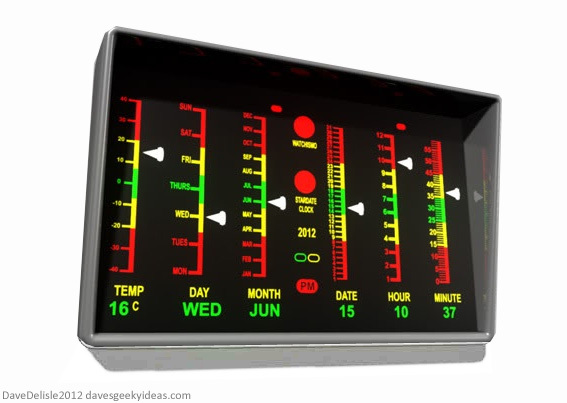
This would be a wall clock or a desk clock. I honestly wouldn’t know how to make this functional besides being a full LCD display. It’s those arrow indicators that might prove to be problematic in a mechanical clock.
For those who don’t know this is based on the medical panel from the original Star Trek series. It’s actually a pretty big monitor on the wall that towers over every patient. I wouldn’t want to replicate its size for this clock.
This reminds me of the Back To The Future alarm clock I designed from a few years back. Lots of information displayed at once (I hope it’s not information overload for some folks).
If you like this gadget you can bug Thinkgeek here. They absolutely love it when people bug them about me.
Share this:

Geek Bling Part 7: Spider-Man

This edition of Geek Bling features the friendly neighborhood webhead, who is no stranger to necklaces/chains, but for some reason no one has made the chain itself the web, at least in this obvious a fashion.
The design and pose is based on the 60’s cartoon, which has now been reduced to fodder for internet memes. I have a soft spot for the poorly-animated series, because I feel it was the first ever motion comic (and likely intended as such), not a traditionally animated cartoon.
Nearly had a few of my past Geek Bling designs made, which I would have made available here like I did my hockey jerseys. But alas, can’t seem to find a willing jewelry maker. Hopefully one day I can arrange something for interested people.
Share this:

Speak & Spell iPad Case
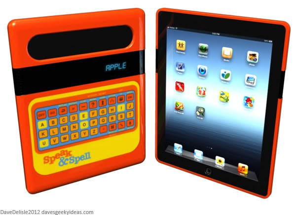
This one is pretty straightforward, an iPad case based on the Speak & Spell educational toy from the 80’s (you whippersnappers might have seen it in the film E.T.). Obviously those from the late 70’s and early 80’s would appreciate the novelty of this idea more.
I know it’s a kids toy, but as I’ve often stated I like things that are inherently nostalgic. I believe only a few geeks would have scruples about being seen with such a childish case.
I suppose the only downside is the ironic hipster vibe this design wields. It’s retro, filled with social commentary about modern electronic devices, and is intended for an Apple product. I should just delete this post. *Sigh!* I’ll leave it be. You hipsters don’t linger around here too long, y’hear?
The odds of this happening are super-slim. Speak & Spell is owned by Texas Instruments, not exactly a competitor of Apple but no ally either.
Sorry to pimp other posts, but you might dig this Crayola 3DS case.

